

The Softening Of Everything
A New Divide

Look at the parts of the world that face the customer. Your banking app. The café near your office. The lobby in a new apartment block. The surfaces are smooth and calm. Corners are rounded. Colors are gentle. The copy speaks in a friendly, knowing voice. It feels like the whole environment has been padded. At the same time, anxiety is high, inequality is widening, and trust in institutions is thin. That gap is not an accident. It is the point.
The world that faces you is padded. The world that supports it is not.
Soft design as class filter
Soft design is not just taste. It is a class filter. People at the top of the economy live inside spaces and interfaces that tell them things are under control. People further down are often the ones making that smoothness possible, usually in places that feel nothing like it.
Start with the phone in your hand. On the front stage, the experience is a glide. Cards rise into view. Buttons respond with subtle movement. Error messages apologise in gentle language. The emotional temperature of the feed is lukewarm and stable.
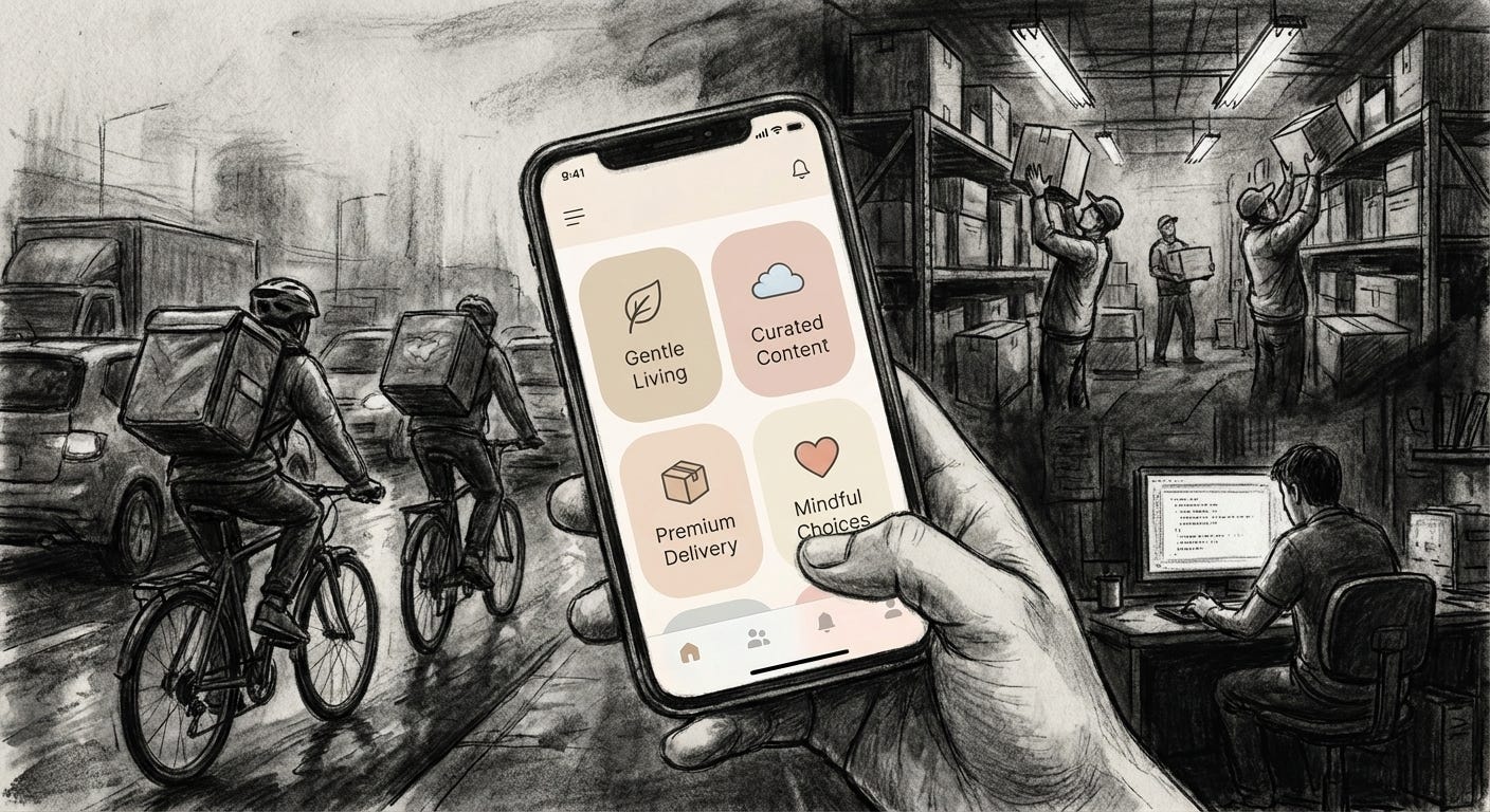
Behind that surface sits a different reality. Delivery drivers racing timers. Warehouse staff tracked by scanners. Moderators watching the worst material on the internet. Small sellers fighting opaque ranking systems and payout rules. None of that looks like the home screen. The soft layer is what the system shows you while other people absorb the discomfort.
The nicer the app looks, the more likely it is that someone else is holding the risk.
A clean interface does not simply happen. It is paid for in someone’s unpaid waiting time, someone’s unstable contract, someone’s sleepless night. Softness here is not neutral. It is subsidised.
Inside the glass, outside the glass
You see the same split in physical space. Inside the glass walls of an office tower, the lobby is pale stone and warm light. Plants soften every edge. Sound is controlled. Coffee is good. The experience is one of composure.
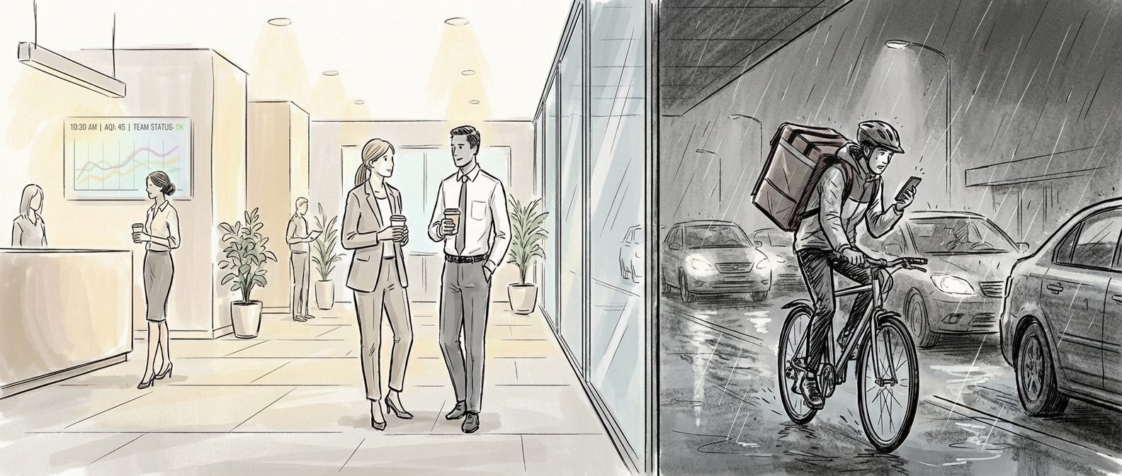
Outside the glass, a rider balances a phone and a thermal bag in traffic. Inside, a meeting slides back by thirty minutes. Outside, that delay becomes an extra lap around the block on a bike.
This is a form of theatre. Comfort concentrated in certain rooms. Risk pushed to the edges. The softening of everything is not evenly shared. It clusters around people with salaries, health insurance, predictable rent.
For everyone else, the world often feels harder. Housing costs that climb. Shifts that change at short notice. Debt that drags on for years. No interior mood board fixes that.
Comfort in one room is often financed by discomfort in another.
Pastel finance and self care debt
Brands understand this divide and sell directly into it. The affluent customer wants to feel calm, competent, and slightly virtuous. So banks, brokers, and financial apps now present themselves in the same visual language as wellness products.
A savings interface looks like a meditation tool. A credit line arrives wrapped in the aesthetic of self care. The message is simple. Looking after your money is just another form of looking after yourself.
The risk has not left the system. It has moved. Away from large institutions that used to absorb more of it, toward individuals who tap to agree on long legal screens they do not read. The visual tone tells them this is safe, current, empowering.
When a debt product looks and sounds like skincare, the step from self improvement to self exploitation gets very small.
The soft city and the hard ring
There is a geographic story here too. The soft world is central and urban. It is the triangle of café, office, and transport hub. Coworking rooms with good chairs and many chargers. Natural wine bars on the walk home. Everything that touches this life has been designed to feel intentional.
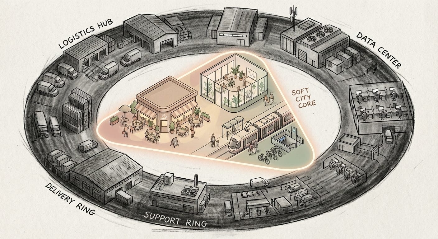
The hard world is the ring around it. Logistics depots. Data centres. Call centres. Drive through lanes. One radius lives inside a carefully composed calm. The other keeps it running.
Soft aesthetics help everyone involved pretend that the system is basically working. They flatten the difference between a platform that pays fairly and one that burns out its workers. They give the same gentle surface to a company that lobbies against labour protections and a company that does not.
If it looks thoughtful at the icon level, the story feels thoughtful.
Soft design does not prove a system is humane. It only proves someone knows how to calm you.
When surface rewrites substance
There is also a psychological effect on anyone who spends enough time inside padded environments. Once you get used to everything feeling composed and kind, anything that is not starts to feel broken.
A public service site that looks clumsy feels illegitimate, even if it is one of the few interfaces in your life not trying to extract money. A news story that is visually rough or emotionally sharp is harder to sit with than a polished lifestyle essay.
Over time, the sense of what is serious drifts toward what is well designed. Substance starts to follow surface.
For the top slice of incomes, the softening of everything functions as a perk. Life is volatile and the news is bleak, but the everyday touch points are stable and soothing. You live inside a personal operating system that buffers the shocks. It cannot stop a market crash or a flood, but it can make those things feel distant and faint.
For everyone else, the same softness works more like a sedative. It offers a little comfort wrapped around a hard reality. It invites you to scroll, stream, and shop your way through exhaustion without ever meeting an interface that tells you plainly how skewed the game has become. The calm design gives you a sense of control in systems where you have very little.
Soft design as story
None of this is an argument for hostile design. Confusing, ugly systems usually punish the most vulnerable people first. The point is to notice who is protected by softness and who is exposed under it. To ask why our screens and lobbies keep getting smoother while the numbers underneath keep getting sharper.
Soft design is a story the present tells about itself. It says that if the experience layer feels humane, the rest can be forgiven. Anaesthetik exists to press on that layer. To look at the padded surface and treat it as evidence, not comfort.
When everything around you feels cushioned, the few sharp edges that remain start to look like the only honest things in the room.
Visual archive → afterimage
You’re reading Anaesthetik. The connection got louder. We feel less.