

The Quiet Brand Persona
Whispers In The Wind

Softness Sells
Softness sells. Brands whisper. No all caps. No bright flashes. They post soft pastels and gentle nouns: rest, care, ease. The tone is slow and soothing. They promise calm.
It looks like kindness. It feels like relief. It works like anesthesia.
The Quiet Turn
This is not an accident. It is a strategy.
Aggressive businesses have learned to borrow the language of wellness to appear kind. Startups and banks that once shouted now prefer to murmur. They move away from the hard sell: no more red buttons, fewer exclamation points, less urgency on the surface.
Interfaces follow suit. Text falls into all lowercase, spaced out with breathing room. Color schemes slide toward warm neutrals or soft pinks and blues. Icons are rounded, shadows are gentle, gradients feel like dusk instead of noon. The effect is mild. It catches the eye without raising the pulse.
The copy borrows from mindfulness and slow living. “Breathe”, “relax”, “pause”, “balance”. It is the language of retreats, moved into dashboards and checkout flows. In a noisy digital environment, this quiet persona feels radical, almost ethical. Some marketers frame it as respect for the user’s space, a way to offer “relief” to tired consumers.
The risk is simpler. Soft branding works like a lullaby. It can make extraction feel like care.
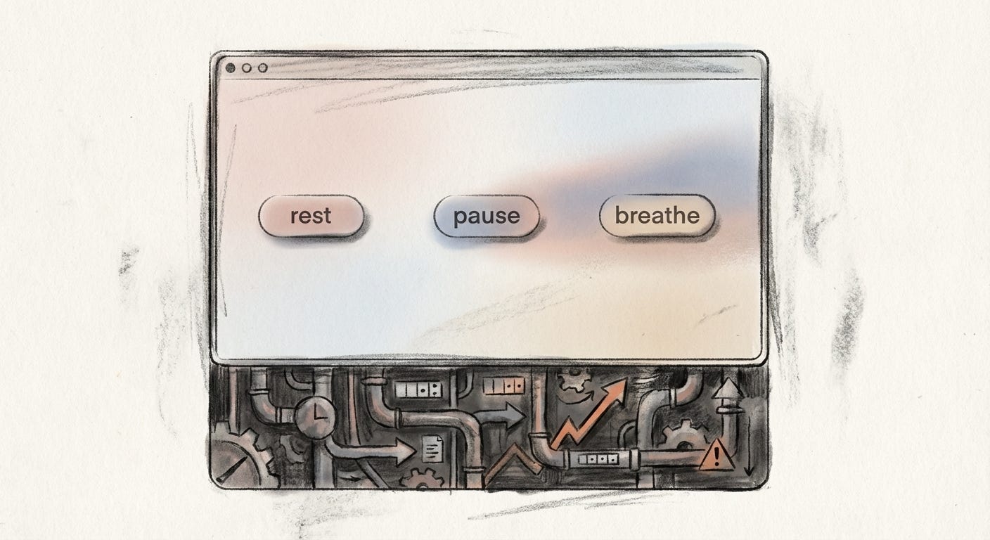
The product stays sharp. Only the edges of how it appears are sanded down.
Slack: A Friendly Face on Endless Work
Slack gives one of the clearest examples.
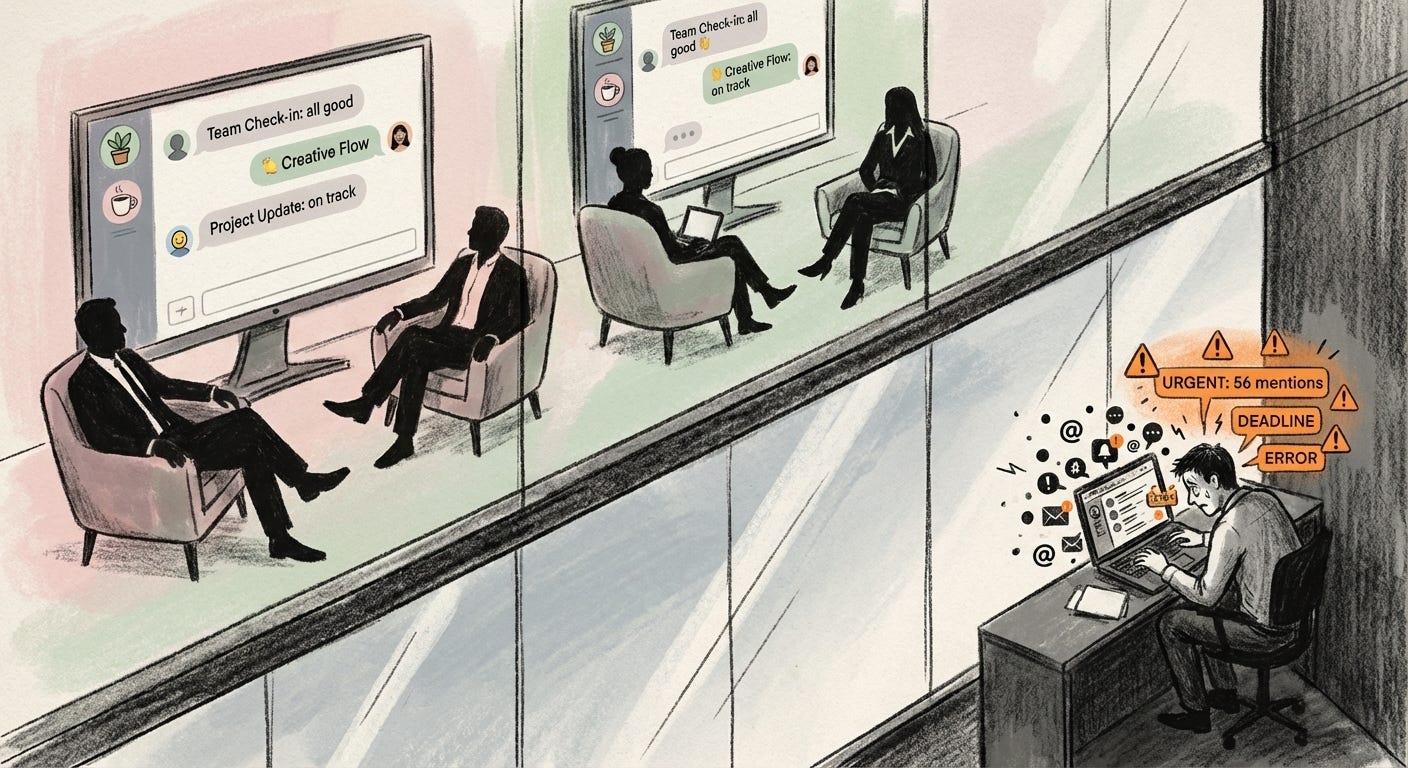
The team chat tool sits at the center of modern office life. It is a system for constant reachability: messages, mentions, channels, notifications that never quite sleep. Yet its surface is soft.
In 2020, Slack redesigned itself to be more “approachable” and “pleasant”. Pastel themes arrived: banana yellow, soft pink, muted greens and grays. Buttons became fully rounded. Panels turned translucent. The interface started to resemble a playful collage rather than a serious control center.
Users could choose themes that made the app feel like a lounge instead of a pager. The overall mood was light, friendly, slightly toy-like. Work, reframed as chat with stickers.
The underlying dynamics did not change. Slack still encourages instant replies, scattered attention, and a sense that you are always slightly behind. The pings keep coming. Threads pile up. Presence dots glow late into the night.
Softness does not slow the machine. It just makes the machine feel less extractive while it runs.
Inside the glass, for designers and executives, this is elegance: a stressful reality wrapped in careful visual comfort. Outside the glass, for people glued to notifications, softened work chat is still work chat. The pace remains manic. It just looks nicer while it drains you.
Calm: A Venture-Backed Sleep Story
Calm sells rest. Sleep more, stress less, breathe. It speaks like a gentle friend.
Open the app or site and you meet a still lake, deep blues, mountain silhouettes. The logo is an all-lowercase word handwritten in soft curves. The layout is pared back. A single button invites you to “try Calm for free”. Nothing feels crowded or urgent.
Design reviews praise this as alignment between brand and interface. The homepage matches the promise: sleep, meditation, relaxation. It looks like an exhale.
Behind the lake view lives a different reality. Calm is a large-scale media and data company, funded by venture capital, populated by growth teams. It continuously expands its content library, hires celebrities to narrate bedtime stories, experiments with pricing and funnels.
For many users, Calm is not a luxury object. It is a last resort. People arrive with insomnia, burnout, spiraling anxiety. They are often workers whose days are already managed by tools like Slack, whose nights are squeezed by precarity or care responsibilities. The app that offers them rest is another screen, another subscription, another place where their mood is measured and optimized.
Rest is presented as a product you can stream instead of a structure you can change.
The visuals keep the tension quiet: the hyperactive logic of platform growth wrapped in the slow-motion imagery of fog over water.
Klarna: Pastel Credit
In finance, softness takes on sharper edges.
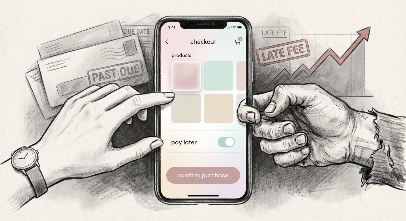
Klarna, a buy-now-pay-later service, dresses credit in candy colors. Its campaigns are flooded with frosted pink backdrops and neatly arranged sneakers, lipsticks, and phones. Headlines are light and conversational. The overall feeling is young, bright, and unthreatening.
“Pay later” is framed as convenience, not debt. The interface feels more like browsing a fashion lookbook than engaging with a lender. A common reaction among younger users is that Klarna “doesn’t feel like a normal, serious, adult credit situation”. It feels playful and low-stakes, with a “don’t worry, just pay us back later” mood.
Yet structurally, Klarna is a credit system. Purchases are made with borrowed money. Late payments, fees, and collections are part of the business model. For someone with a stable income and savings, soft credit is a flexible tool. For someone living close to the edge, it can deepen the spiral: another bill, another reminder, another entry on a report.
The pastel aesthetic flattens those differences. It tells everyone the same story: this is light, this is easy, this is fine.
Softness here is not neutral. It protects the company more than the customer. It makes the idea of going into debt feel barely worth noticing, even as the firm scales into a powerful financial actor.
Mood As Buffer
Across these examples, the mechanism repeats.
Soft color and hushed tone work as buffers. They stand between people and the full force of what is happening.
The brand voice is soothing. The logic is not. Slack keeps teams reachable at all times. Calm keeps users inside a screen for relief from screens. Klarna normalises consumer debt as a casual lifestyle choice.
Quiet branding experts talk about “less is more”. Fewer, softer messages do not simply clutter less. They often cut deeper. Minimal copy leaves less for users to argue with. Soft palettes reduce visual friction, so the action flows smoothly: sign up, accept, click through.
The less a brand says, the more your own feelings rush in to complete the sentence.
Who benefits from this arrangement is uneven.
For executives and investors, softness is a risk management tool. It keeps the public mood from tipping into suspicion. It reduces the chance that alerts, legalese, or sharp lines will trigger alarm. It buys more time and more consent.
For precarious users, softness can be a subtle trap. A calm surface makes it easier to ignore the pressure beneath: the long hours, the late fees, the way rest is put behind a paywall instead of built into the week.
Class lines run through the same interface. The person designing the pastel dashboard sees craft and clarity. The person clicking “pay later” after rent is due sees only a brief sense of ease.
The Aftertaste of Calm
Softness in design is not inherently dishonest. It can lower anxiety, ease navigation, and make complex tools less punishing. The problem is not that things look gentle. It is what that gentleness is used to cover.
When every aggressive practice arrives wrapped in calm, calm itself starts to feel suspicious. The tone that once signaled care becomes a sign that someone, somewhere, is smoothing the edges of something sharp.
The more interfaces whisper, the more we have to strain to hear what is underneath.
Visual archive → afterimage
You’re reading Anaesthetik. The connection got louder. We feel less.