

The Dulling of Avant-Garde Design in Affordable Luxury
Recycled Status Quo

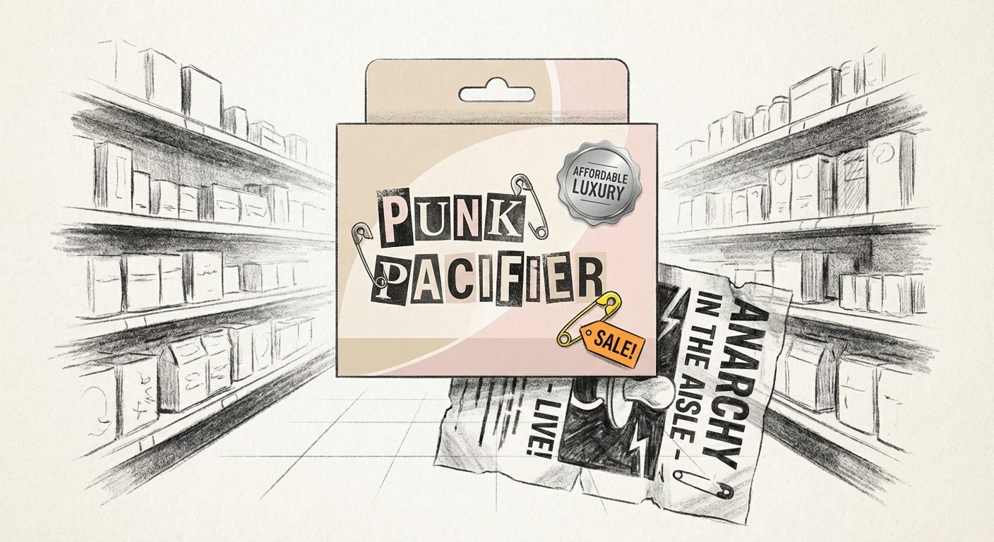
Picture a baby pacifier campaign dressed in spiky punk graphics and ransom-note lettering. What once spat in the face of good taste now coos from the baby aisle. The revolt is still visible on the surface. The feeling is gone.
This is the quiet story of a fade. Gestures that once signaled risk and refusal have slipped into the visual background. Under the reassuring label of “affordable luxury,” aesthetics born at the edge now arrive as pre-approved templates. The rare and the subversive survive as decoration, tidied up for mass comfort.
What was born to provoke now exists mostly to reassure.
From Radical To Routine
Part of the shift is technical. Design tools have been liberalised. Anyone with a browser can summon Canva, Figma, or a million template marketplaces. There is an unspoken rule now: even the most disposable output should look “on-brand”. A party invite, a niche candle, a side-project logo. Nothing is allowed to look rough.
Templates, drag-and-drop interfaces, and endless font packs compress years of visual experimentation into a set of defaults. What began as a risky aesthetic choice becomes a menu item. Pick “brutalist cover”. Pick “editorial minimal”. Pick “grunge flyer”. The machine will handle the rest.
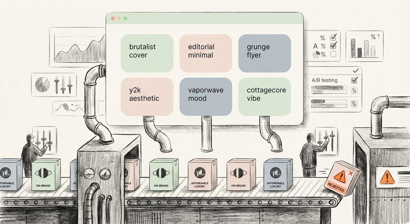
This democratisation has raised the baseline. There really is more competent design in the world. But it also floods the field with near-duplicates. Every tool that makes it easier to look “premium” also makes it easier to look the same.
In parallel, the market discovers that high-design aesthetics sell aspiration. Masstige marketing builds an entire economy on this insight. Mid-tier goods borrow the signals of luxury without the price: sparse layouts, quiet palettes, delicate type, matte finishes, small touches of metallic ink. Packaging consultants openly advise small brands to “use white space, elegant fonts, and matte textures” to create a perception of quality.
The code was once reserved for perfume counters and couture. Now a supermarket candle and a discount moisturizer speak the same visual language. Affordable luxury becomes a visual filter that can be applied to almost anything, from ready meals to fintech apps.
Then comes data. As soon as an avant-garde look proves it can perform with a wide audience, research decks and A/B tests turn it into a recommendation. Visual strategy becomes risk management. Better to follow the pattern that yields a stable uptick than search for a new one that might fail. Products designed for a target converge on the safest shared middle.
The result is a strange inversion. The more an aesthetic once signaled difference, the more likely it is to be rolled out everywhere once it is proven to work.
When Friendly Turns Featureless
One clear zone of fade is the family of flat, friendly illustration styles often nicknamed “Corporate Memphis”. At first, these blob-limbed figures and soft gradients felt like a response to cold interfaces. They promised warmth and inclusivity. They softened high-tech systems for people newly arriving on digital platforms.
Tech sites, startup decks, and onboarding flows adopted the style to announce that they were approachable. Banking apps used smiling characters to tell you overdraft alerts were nothing to panic about. Health apps wrapped serious topics in rounded limbs and pastel scenery.
Today those figures are wallpaper. They appear on tax portals, hospital posters, delivery apps, and HR portals. What began as a small rebellion against sterile enterprise design has become enterprise design. It still signals friendliness, but so universally that it hardly registers.
A similar path unfolded for anti-design and “ugly” design. Harsh, clashing typography and chaotic composition first showed up as a way to resist the dull sameness of brand systems. Pop musicians used cut-and-paste collages and broken type to reclaim some mess. Independent magazines and fashion labels borrowed zine aesthetics to signal friction.
Then the experiments got results. Anti-design covers moved units. Glitchy visuals traveled fast on social feeds. Within a few seasons, high-fashion houses and global brands began to use the same raw look, strategically. What was once “we refuse your grid” became “this quarter’s brand territory”.
When a business magazine uses garish misaligned type to illustrate a special section, it is no longer rejecting corporate polish. It is corporate polish, wearing a torn T-shirt for the weekend.
Anti-design arrives as a refusal and leaves as a preset.
Punk For Pacifiers
Punk was never meant to be tidy. Xeroxed flyers, graffiti text, and torn images spoke from the edges of the economy. They were cheap, fast, and hostile to the idea that design should be comfortable.
Advertising watched and learned. An archive of campaigns documenting punk influences shows the progression clearly. Early on, brands only flirted with borrowed grit. Over time, entire campaigns took on the look, stripped of context.
The pacifier ad is emblematic. Safety pins, distressed type, and grimy textures surround a product designed to soothe both baby and parent. A visual language once aligned with anti-consumer rebellion now encourages consumption, especially from anxious middle-class caregivers who grew up with the myth of punk.
The mood of revolt is available on demand. The conditions that produced it are not. The discomfort of the original scene migrates off-screen, into factories, supply chains, and precarious jobs that rarely appear in the frame.
In this translation, punk becomes a spice. It adds “edge” to a safe purchase. The parent gets to feel adjacent to rebellion without ever having to encounter actual risk. The working conditions and politics that punk once screamed about remain untouched.
Masstige Minimalism Everywhere
Another visible fade happens in the aisle of quiet boxes. Luxury minimalism used to mean bespoke forms, obsessive detail, and a disciplined restraint that only a small audience would recognise. These objects carried a specific class signal. They said: someone spent time and expertise shaping this.
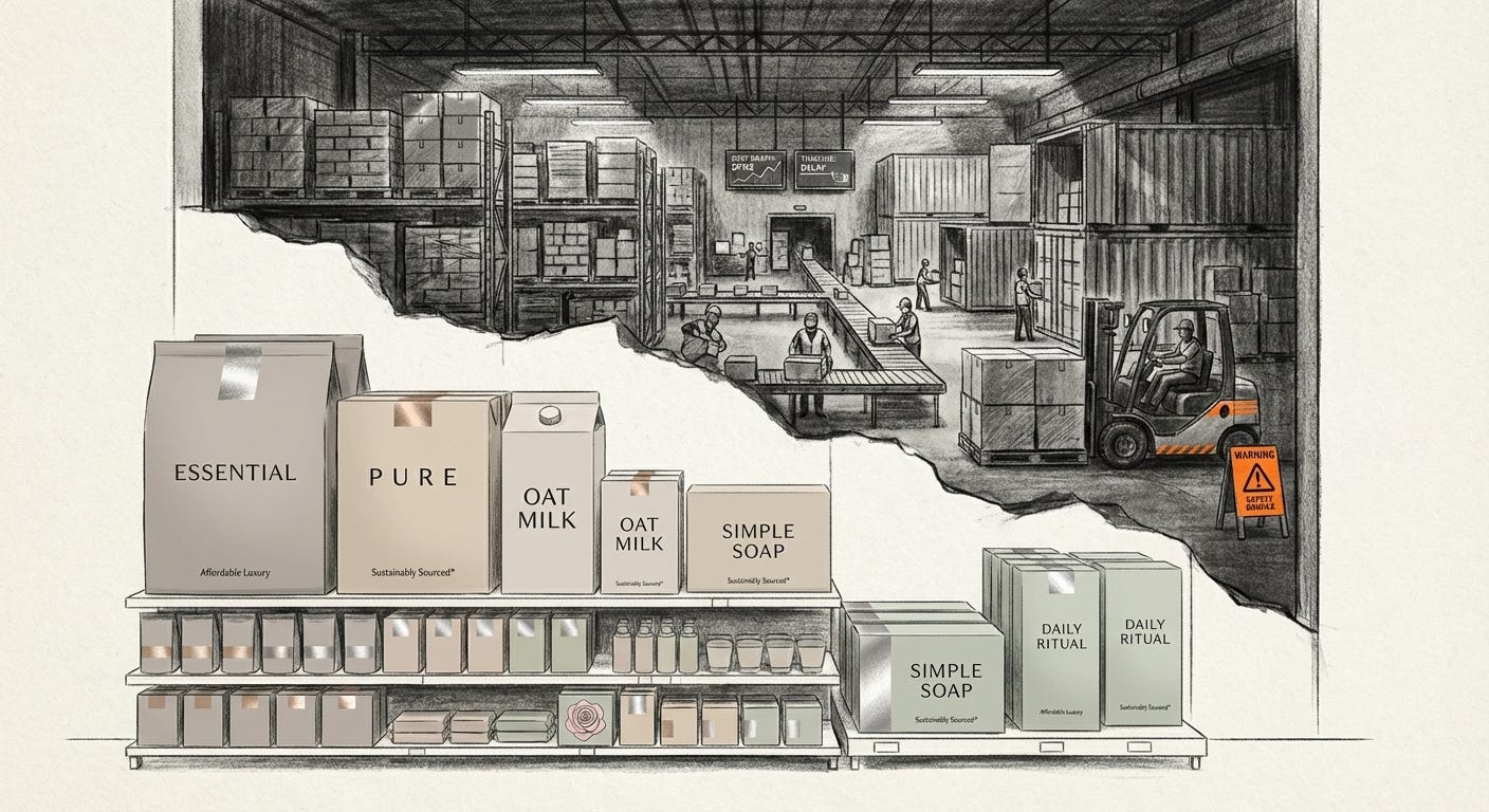
Masstige minimalism compresses that into a surface treatment. Smooth, monochrome packaging. Centered wordmarks in refined type. Carefully spaced labels. A single accent color. It works instantly because we have been trained to see restraint as expensive.
Guides for small businesses lay out the formula with comforting clarity. Use matte finishes. Limit your color palette. Choose a serif or high-contrast sans-serif for elegance. Add a metallic accent if you can. The result is an endless shelf of products that all promise a similar upgrade: you can have “a little luxury” without paying premium prices.
Who benefits from this arrangement. Customers get a more pleasing visual environment and a small hit of aspiration in the middle of the weekly shop. Brands in crowded markets buy into the same formula because not doing so now feels risky.
Who pays. Independent designers who once distinguished themselves with a minimal language now compete with automated templates. Factory workers and logistics chains still absorb cost pressure so that the outer shell can stay quiet and refined. The visual calm on the box has no obligation to match the turbulence behind it.
The Formulaic Luxury Comedown
When avant-garde gestures become standard, something in our perception dulls. The first time you see a genuinely radical layout or object, there is a small jolt. It tells you that another way of arranging the world is possible. After the hundredth imitation, the same visual cue reads as “well-designed” and nothing more.
This has consequences for feeling and for power. A culture saturated with “good design” and “affordable luxury” is easier to sit inside without asking many questions. The world looks taken care of. Interfaces are soft. Packaging is tasteful. Even rebellion looks house-trained.
The people most insulated from risk get the most from this arrangement. For the already secure, formulaic luxury offers frictionless upgrades: nicer soaps, calmer dashboards, smoother subscriptions. For those under economic pressure, the same visual language offers the promise of access while diverting attention from structural limits. You can buy into the aesthetic of a life that remains out of reach.
For businesses, sameness creates its own anxiety. If every category has caught up visually, nobody truly stands out. The response is an arms race for the next “edgy” trick. When minimalism went blunt in the 2010s, deliberately ugly and absurd design rushed in as the new differentiator. These, too, are now sliding into template form.
The cycle tightens. Each wave has a shorter half-life. What shocks on Monday is a Figma kit by Friday and a supermarket label a season later.
The more efficiently a style spreads, the faster it loses its ability to surprise.
After The Fade
The fade is not a collapse. It is a slow bleaching. A bold colour left too long in the sun. The lines remain. The saturation drains.
There is no simple cure for this. The same tools that flatten the avant-garde also allow more people to participate in visual culture. The same masstige codes that numb our sense of rarity also make certain forms of beauty more widely available.
What we can notice is the trade. Every time a radical aesthetic is smoothed into affordable luxury, it carries less of its original charge and more of the system’s preferences. Comfort gets subsidised by someone else’s invisibility. Mood stands in for meaning.
In the end, perhaps this is the most honest name for the pattern: not death, just fade. A rebellion that continues to live in surface form, quietly at rest, even as the world that made it urgent drifts further out of frame.
Visual archive → afterimage
You’re reading Anaesthetik. The connection got louder. We feel less.