

The Aesthetic of Innocence
Deceptively Kind

Softness sells.
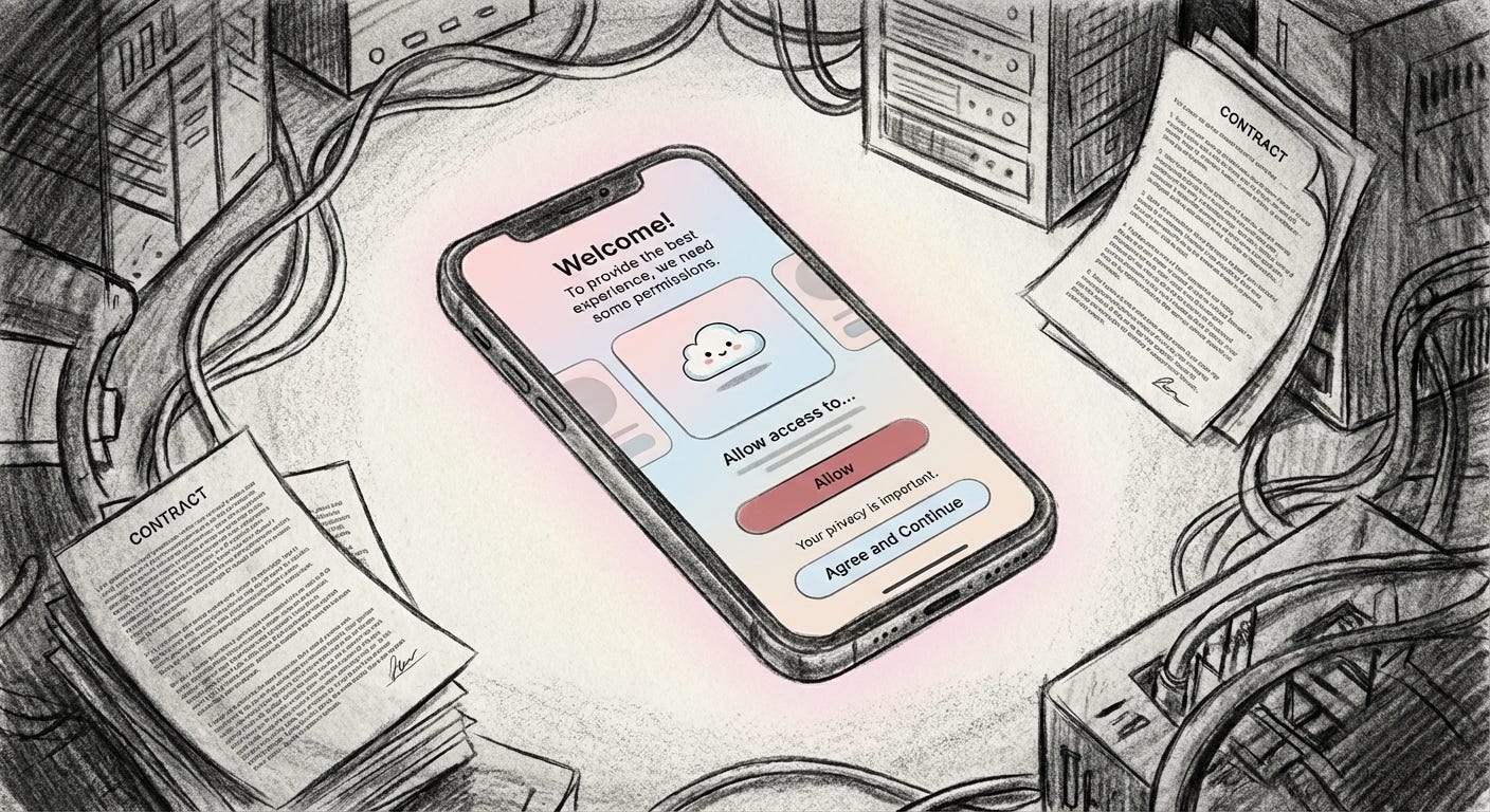
Pastel apps, adorable avatars, pillowy fonts. They line up on our phones like toys on a shelf, each offering help or happiness with a gentle smile. The look is harmless by design, a visual apology before anything demanding can appear.
Visual softness has become an armature for trust. Rounded shapes, muted brights, childlike motifs, all signal that nothing bad will happen here. These cues tug at older instincts. We treat a cute brand like we treat a small child, still growing, still learning, deserving patience and protection. We feel generous. We lower our guard.
The point is not just that things look pretty. It is that prettiness steps in ahead of scrutiny. We click Allow, sign up, add to cart, already warmed by a sense of innocence that the product has carefully staged for us.
The aesthetic of innocence arrives before the terms and conditions.
Mechanism: Disarming by Design
Softness in design is rarely accidental.
Pastel palettes lean on associations with babyhood and purity. Powdery pinks, gentle blues, creamy whites suggest something unspoiled, closer to skin, closer to nature. Packaging for beauty, wellness, and home goods uses these colors to hint at safety for your body or the planet, often more insistently than any written claim.
Interfaces follow the same script. Rounded corners, generous white space, smiling mascots, no hard edges, no abrupt contrasts. Error messages arrive as soft nudges rather than sharp alerts. Even refusal or risk is phrased as a caring suggestion.
The trick is simple. By styling themselves as tender and slightly vulnerable, products and platforms invite us to see them as caregivers or companions instead of infrastructure and business models. The relationship is recast. You are not being managed, you are being soothed.
In that mood, questions about extraction, power, or harm feel out of place, even rude. The visual language absorbs the tension before it can surface.
Evidence Zone 1: The Soft Girl as Shield
On TikTok, the Soft Girl aesthetic gives this strategy a human face.
Soft Girl creators lean into pastel sweaters, plush accessories, heart clips, glossed lips, and a deliberately gentle, almost doll-like demeanor. It is a performance of sweetness that borrows heavily from childhood and hyper-femininity: smallness, softness, non-threat.
The innocence is not a side effect, it is the product. A Soft Girl stream arrives wrapped in a mood of kindness and fragility. To criticise feels like kicking a kitten. The visual language makes skepticism feel like cruelty.
This is not only about individual style choices. It is about a broader economy of attention and safety. Younger women and queer creators often understand that looking harmless online can be its own form of armor, a way to deflect hostility and harassment. Softness becomes a survival tactic.
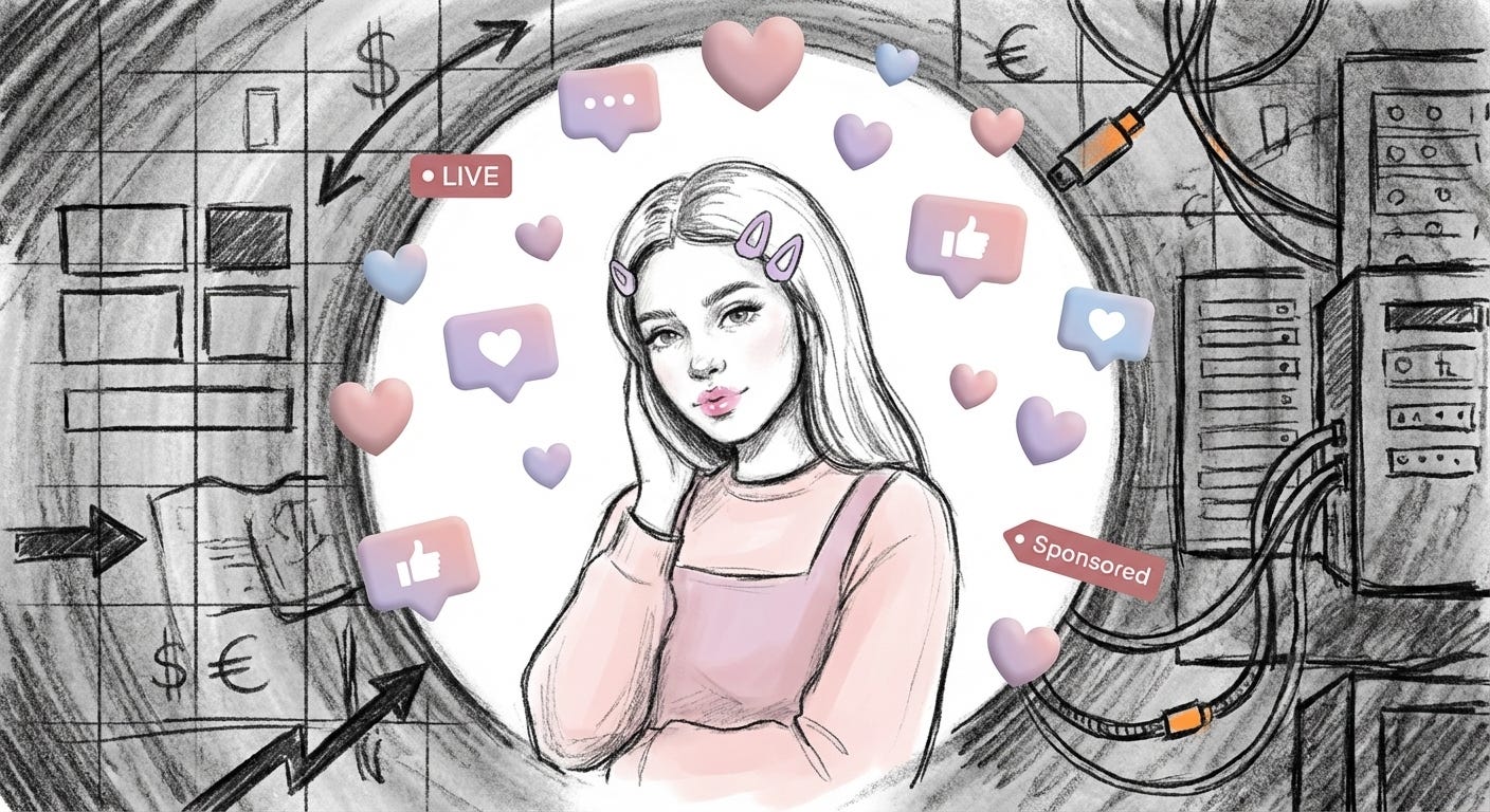
At the same time, platforms and advertisers benefit from this mood. When femininity is framed as endlessly sweet and visually low-risk, the underlying system that amplifies, monetises, and sometimes endangers these creators stays out of frame. The burden of being non-threatening sits on the person in front of the camera, while the machinery behind the screen continues uninterrupted.
The Soft Girl is both shield and bait: protecting the creator from some forms of aggression, while drawing in viewers and brands with a ready-made atmosphere of trust.
Evidence Zone 2: Soft Tech, Safe Tech
Technology companies have learned the same lesson.
Artificial intelligence is complex, opaque, and often unsettling. Yet AI tools arrive dressed like sleep apps. Rounded logos, sky gradients, smiling chat bubbles, illustrated companions with wide eyes and soft cheeks. Consumer robots are given large, rounded heads and tiny bodies to reduce perceived threat. Smart speakers look like fabric-wrapped stones.
Meanwhile, serious domains like personal finance, investing, and mental health show up as pastel dashboards with cute icons and reassuring tone. The color choices drain the intensity from subjects that should invite careful thought: debt, savings, burnout, burnout again. A cartoon mascot stands between you and the legal fine print.
In the direct-to-consumer world, a whole generation of “bland” brands has settled on the same soft minimalism. Toothbrushes, deodorants, supplements, even banks arrive in nearly identical baby-blue or millennial pink shells. The effect is to build a background of gentle familiarity where everything feels honest, or at least too harmless to matter.
A pastel interface can feel like care while it quietly routes value upward.
When the visuals do so much emotional work, the underlying terms feel negotiable. Data collection, lock-in subscriptions, fragile business models propped up by venture capital, all recede behind the calming gradient. You are not entering a financial relationship, the screen suggests, you are joining a supportive little world.
The comfort is real at the level of mood. The safety is not.
Evidence Zone 3: Cute Logos, Softer Accountability
Softness also changes how we respond when things go wrong.
Research in branding has found that “cute” logos and mascots can make consumers more forgiving of missteps. A big-eyed character or rounded wordmark invites us to treat the brand like a naive youngster who did not mean to cause harm. We are more likely to explain away faults, to hope they will “do better next time,” to feel almost protective.
This is not trivial. When a product fails, a service leaks data, or a company behaves badly, the emotional cushioning of a cute identity can blunt public pressure. People complain, but less harshly. Boycotts feel disproportionate. Outrage softens into mild disappointment.
For the people on the receiving end of real harm, especially those with fewer resources or less margin for error, this softening matters. Refunds, regulation, and reform often depend on sustained collective anger, not on a sad shrug at a smiling logo.
The innocent aesthetic does not erase harm. It repositions it as an unfortunate mistake made by someone we like.
Consequence: Where Friction Goes to Die
All of this adds up to a quiet shift in how we meet the world.
Friction used to be a signal. Confusing interfaces, hard edges, ugly warnings: these were cues to slow down and pay attention. They were not pleasant, but they marked moments of risk or decision.
In an environment coated in softness, those cues fade. The more every surface smiles at us, the harder it becomes to locate our own skepticism. The questions that might have surfaced get delayed, then forgotten. We have already tapped Agree, already scanned our card, already uploaded the document.
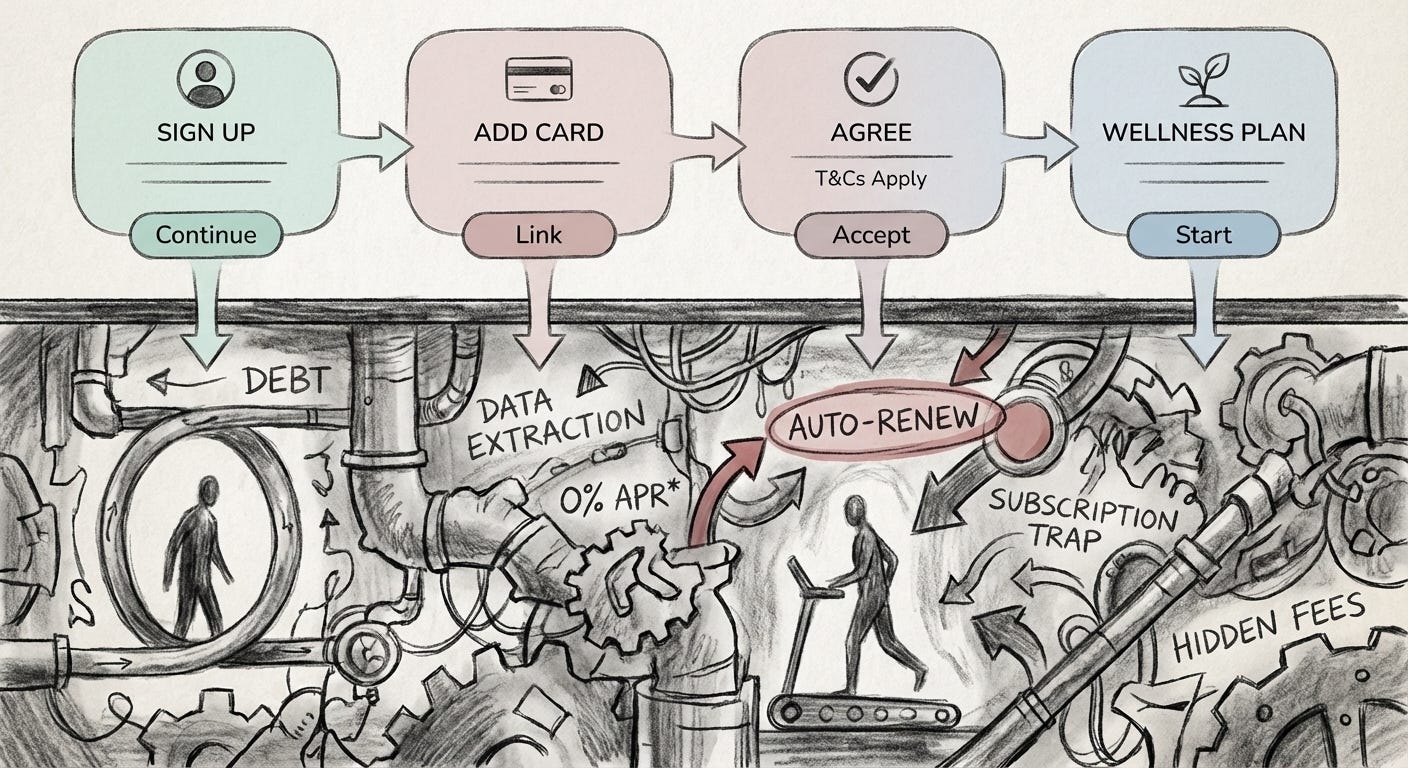
This has different consequences depending on where you stand. For people with stable incomes and safety nets, an over-gentle app may only mean too many subscriptions and a vague sense of unease. For those living close to the edge, the same design patterns can mean predatory credit dressed as empowerment, data extraction framed as personalised care, wellness routines that never address the structural causes of stress.
Softness does not cause these inequalities. It helps them operate discreetly.
When critique feels emotionally mismatched with the visual tone, class tension is easier to divert. Power can move without looking like power. Platforms become mood machines, converting structural questions into lifestyle choices.
Close: Looking Past the Pastel
The aesthetic of innocence is not neutral. It is a decision about how much doubt is allowed into the room.
Soft design can make hard things more approachable. It can also smuggle harm past our defenses, trusting that we will hesitate to raise our voice at something that looks so gentle.
The work now is simple, and uncomfortable: to notice when softness arrives early and ask what it is trying to smooth over.
The pastel is just a surface. The terms are still underneath.
Visual archive → afterimage
You’re reading Anaesthetik. The connection got louder. We feel less.