

The Aesthetic of Care vs Actual Care
The Soft Veneer Of Care

Light pastels and gentle curves promise a comforting world of care. The screens are calm, the corridors are tranquil, the icons are smiling. On the surface, it feels like someone has already done the hard work for us.
Behind that surface, care is still heavy, messy, and unevenly carried. Design just makes it look weightless.
The promise of effortless care
Care is increasingly presented as a smooth experience. A wellness app bathes you in soft gradients and slow animations. A hospital lobby stretches out in quiet blues and greens. Mutual aid is compressed into pastel slides you can share in one tap.
Everything signals the same message: care can be tidy. Comfort can be delivered as a service. Anxiety can be managed in a few steps if you follow the right flow.
Design practice reinforces this story. Case studies speak of “building trust” with gentle color, rounded typography, and “flow-based” journeys. Microcopy is warm. Animations are reassuring. The mood suggests that care is a matter of good guidance and better fonts.
What disappears is the labor of care. The night shifts. The unpaid hours. The emotional load that does not fit in a screen.
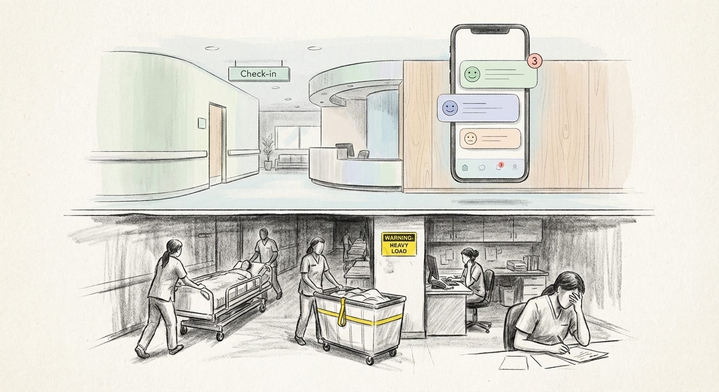
The aesthetic of care is cheap, the labor of care is not.
Soft design is not neutral. It decides which parts of care are visible, and which parts are absorbed into the person on the other side of the glass.
Self-care, newly administrated
Look at a meditation or mental health app. The interface often feels like a spa in miniature. Pale blues, pale greens, rounded cards, encouraging phrases. The tone says: someone is taking care of you.
Functionally, something else is happening. You track symptoms. You set goals. You log triggers. You return every day to “keep your streak.” The app offers guidance, but you perform the work. You become the administrator of your own distress.
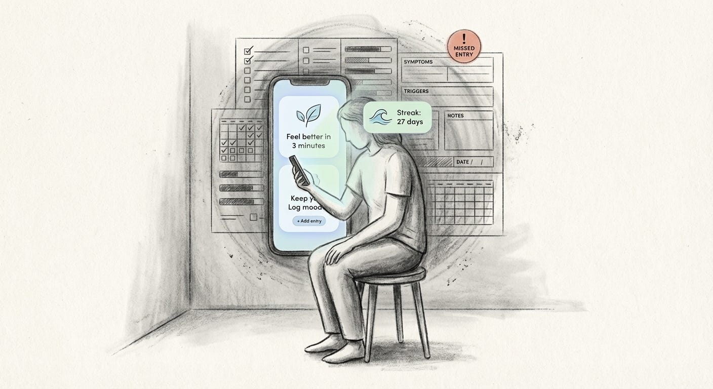
Design language tries to make that labor feel light. Buttons say things like “Feel better in 3 minutes.” Breathing tutorials run as looping animations that suggest ease. UX frameworks talk about “empowering users” and “reducing friction,” as if the burden of staying stable can be smoothed into a funnel.
For people who already have time, privacy, and a quiet room, this can help. For those under constant pressure, the same flows can feel like one more task they are failing at. The pastel screen does not cancel the late rent, the care responsibilities, or the racing mind. It simply reframes them as a personal project to be managed.
Comfort on the surface, accountability underneath. The app looks like a nurse and behaves like a form.
Pastel activism, hard emergencies
The same pattern appears in social media infographics. A crisis begins. Within hours, slideshows appear. Beige or lilac backgrounds. Rounded rectangles of text. Cute icons of raised hands and linked arms. The tone is firm but soothing.
These graphics translate complex, often violent realities into shareable units. They flatten the story into calm steps: “Educate yourself,” “Donate if you can,” “Share this post.” The palette lightens what it presents. Rage and grief arrive as pastel briefings.
Studies of social sharing notice a bias. People are more likely to pass along the most visually polished infographics, the ones with soft colors and neat illustrations, than plain lists of demands or bank details. The algorithm amplifies whatever is both emotionally charged and visually pleasant. An emergency becomes a mood with a palette.
For those watching from a safe distance, this is a comfortable way to feel involved. You repost, you align, you move on. For those at the center of the crisis, the labor of care looks different. They are running kitchens and phone trees, paying for fuel, listening to nightmares, arguing with landlords and officials. None of that is shareable as a clean slide.
Soft activism comforts spectators more than it supports participants. The prettiness buys attention, but it also caps how much discomfort is allowed to leak through.
Healing architecture, hidden strain
Hospitals have learned to speak the same language. Many invest in what planners call “healing environments.” Walls painted in muted greens and blues. Light wood surfaces. Large windows and indoor plants. Corridors designed to feel less like corridors.
Wayfinding systems follow suit. Color-coded routes. Gentle pictograms. Clear type. In diagrams and renders, the hospital appears legible and calm, a place where distress has been anticipated and softened.
On the ground, the picture is less seamless. When signage is incomplete, unclear, or poorly placed, visitors still get lost. They ask at reception, then at the nurses’ station, then at any staff member who looks available. Each small confusion becomes another interruption. Over time, these interruptions add up to hours of diverted labor every week.
Staff report being on the receiving end of visitors’ frustration. Confusion about elevators or wards spills out as rudeness, sometimes aggression. The emotional work of absorbing that anger sits with people who are already overstretched and often underpaid. Decorative calm in the lobby does not protect them.
Research into hospital operations repeatedly comes back to basics: clear signage is crucial for patient flow and safety. When it fails, the very people framed as supported by the system end up supporting the system, with their time and their nerves.
The architecture photographs as caring. The labor structure does not.
What softness hides
When care is consistently depicted as serene, we start to misread what care requires.
We complete a short breathing exercise and feel briefly proud, even if the fear behind it still sits in the body. We share a pastel infographic and register ourselves as “aware,” even if we do not move any money, change any plans, or offer any time. We walk through a tranquil clinic corridor and trust that calmness reflects resources, even if the staff ratio is brittle and the waiting list is months long.
Soft design does not create these inequalities. But it shapes how easy they are to see.
Care work is already invisible in most statistics. The unpaid hours of looking after children, elders, sick friends. The informal help in migrant communities. The emotional processing done quietly at home. This work is uncounted and unequally shared. It falls heavily on women, on poorer households, on people who cannot pay someone else to do it.
When brands and institutions sell images of frictionless care, they add another layer of cover. The more we attach care to soothing surfaces, the easier it becomes to ignore the bodies and schedules that make that soothing possible.
Softness on the surface often relies on someone else absorbing the shock.
Inside the glass, care is packaged as experience. Outside it, care remains a sequence of demanding, sometimes degrading tasks.
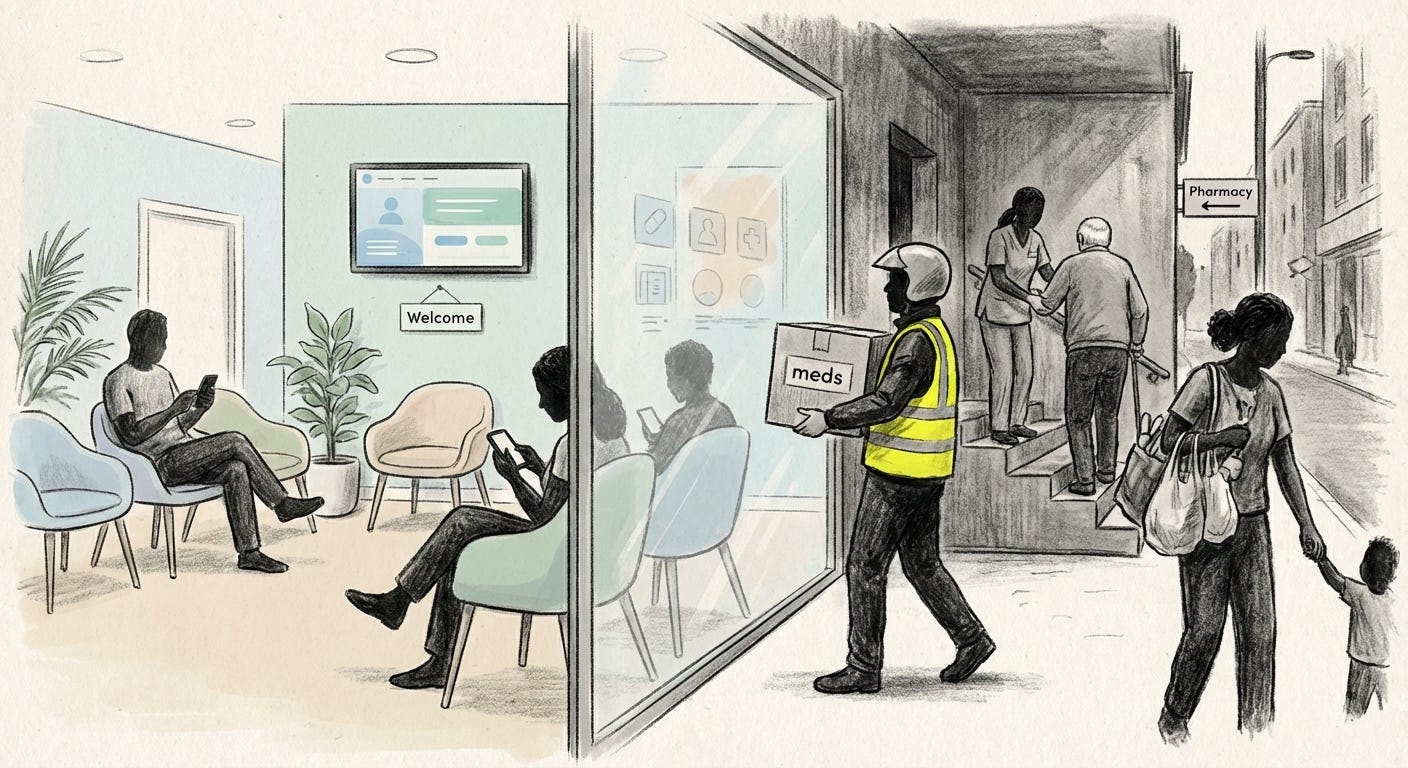
Beyond the pretty window
The soft veneer of care is not useless. A calm corridor can genuinely reduce panic. A well designed app can offer tools that some people never had. A clear graphic can explain something in seconds that text alone might muddle.
The problem is not that care looks gentle. It is when that gentleness becomes the main evidence that care exists.
A future that takes care seriously would treat visuals as an honest map of the work behind them. Screens that admit their limits. Campaigns that foreground the unglamorous tasks. Buildings that direct people so well that staff are free to care rather than constantly redirect.
Until then, it helps to remember a simple thing when a product or place promises to hold you: somewhere, someone is holding the weight that lets it look effortless.
Care is not what calms the picture. Care is what survives when the picture falls away.
Visual archive → afterimage
You’re reading Anaesthetik. The connection got louder. We feel less.