

Nostalgia as noise canceling
Good Old Days

Pixel grain, VHS blur, fake tape hiss.
Screens dress up as older machines and the present starts to sound quieter.
Nostalgia does not just look soft. It works like noise canceling for the now.
Nostalgia wraps the present in the visual language of a safer time so we do not feel how sharp it has become.
Nowstalgia as comfort filter
Designers keep returning to the recent past. Y2K gloss, translucent plastics, pixel fonts, fake media glitches. These styles are sold as fun references and playful throwbacks. Underneath, they do something more serious.
Culture moves so fast that the early 2000s already feel like a stable era. Psychologists who study nostalgia describe this move clearly. When life feels rough, people turn toward a past that appears safer and less risky, even if that safety is more fantasy than fact. Those memories help shore up self esteem, identity, and a sense of belonging.
Design leans on that mechanism. When apps and brands wrap themselves in retro filters, they borrow that emotional buffer. Grainy film overlays, vintage logos, amber tones and faded palettes turn current products into cozy artifacts. A piece of software starts to feel like something you could have grown up with.
The effect is to reframe the present as already-historical. Something has just been released, but our eyes read it as memory. That distance is calming. It makes today feel less like a live event and more like a story whose ending we already know.
This comfort does not land evenly. It is tuned to people whose worst problems can be softened by a visual mood. For those whose present is already harsh in material ways, a warm filter is not protection. It is decoration on top of risk.
Grain, hiss, and the illusion of hand
The new nostalgia is textural. Designers add dust and blur to screens that are technically sharper than anything in human history. A live video gets a film grain overlay. A game UI bends with fake CRT curvature. Sliders feel like tape.
These techniques add deliberate roughness to perfectly clean images. They scatter light, break lines, soften contrast. Some visual researchers point out that fine grain can even reduce eye fatigue because it introduces tiny inconsistencies, so the viewer does not stare into a flat, sterile field. The picture feels layered and alive.
What matters is the signal these imperfections send. A wobble in a scan line, a speck of dust on a digital photograph, a smudge at the corner of a panel. All of them hint at hand work. They stage “evidence” of a physical process, even when the whole thing was generated by a preset.
Imperfection is now a visual effect you can toggle in the menu.
In theory, this makes technology feel more human. In practice, it performs humanity while keeping the underlying systems just as opaque. The grain is real only on the surface. The code behind the surface remains invisible, and that invisibility benefits whoever owns the code.
Apps that pretend to be objects
The same pattern shows up in interfaces. Many products now present themselves as almost-analog tools. Buttons and sliders gain a satin sheen or a rubbery squish. They behave like knobs. Icons move from glossy 3D back to simple, pixelated outlines that recall early operating systems and console UIs.
Design teams describe these choices as humanizing. A grainy photo background feels like an album cover instead of a sterile dashboard. A brushed metal control panel calls back to stereo equipment rather than corporate software. Worn edges and fake scuffs suggest history, use, and care.
Color does more work here than it looks. Warm, faded palettes that echo 80s posters or 90s packaging set an immediate emotional tone. Muted reds, soft browns, washed-out pastels all hint at age and familiarity. Modern bright whites and hard blues signal cleanliness and efficiency. The retro spectrum signals comfort and continuity.
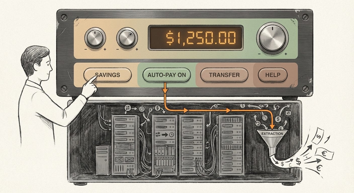
On the surface this looks like harmless styling. Underneath, it is a strategy. If your banking app, health portal, or AI tool feels like an old hi-fi or family photo, you are less likely to approach it with suspicion. Class and power sit quietly in this exchange. The company gets your data, your attention, your recurring payments. You get a warm atmosphere for the transaction.
Cereal boxes, soda cans, and soft timelines
The same move is loudest on shelves. Packaged goods lean hard on retro.
Cereal boxes reappear with hand-drawn mascots and flat 2D illustrations that mimic older print runs. Dessert brands trade their glossy 2000s look for typography and color blocks that recall the 70s and 90s. New companies, barely a few years old, dress their cans and labels in “old soda shop” colors and vintage-style line drawings, then proudly describe the result as retro.
Streaming platforms copy 90s TV bumpers for their ad breaks. Photo apps offer “vintage Kodak” or “analog film” filters that add scratches, flare and soft focus to pristine sensor data. The pattern is no longer niche. It is the default.
Nostalgia becomes a visual subsidy. For the brand, it reduces the cost of trust. Instead of building credibility through long-term behavior, they can rent the credibility of a remembered era. For the customer, it offers temporary relief. The future may feel unstable, but the cereal box looks exactly like it did in childhood. Something, at least, seems to stay put.
This is not neutral. It stabilizes mood without stabilizing material conditions. It gives the sensation of continuity even when the underlying economy, climate, or politics are anything but continuous.
Nostalgia in an overclocked present
The demand for this comfort is not invented by marketers. It is already there.
People report longing for times before everyone was permanently online, even if they never lived in such a time. Younger digital natives feel nostalgic for eras they know only through media. Soft-focus landscapes, muted greens and the visual language of older animation or film are processed by the brain as safe space. Researchers looking at this effect connect it to networks associated with calm reflection.
Designers simply build products that lean into this. Retro filters, throwback skins, faux-analog gadgets. All of them slow the perceived tempo of the feed. They say: this is not another demand on your attention, it is a familiar object you already know how to hold.
In a world of constant novelty, nostalgia functions as a speed governor. It tells the nervous system to downgrade urgency. That easing can be protective at the level of the individual. It can also be convenient at the level of power. A population soothed by sentimental design is one step further away from noticing how fast the ground is moving under its feet.
When everything is a throwback
There is a cost when almost every surface starts performing the past.
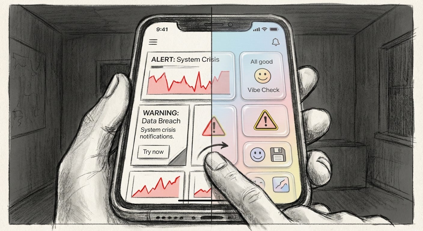
If each interface looks like a cozy relic, the sharp edges of the present blur. Crisis graphics arrive wrapped in pastel gradients. Alerts about instability sit beside faux-VHS title cards and sepia tints. The eye reads the whole scene as aesthetic, not as warning.
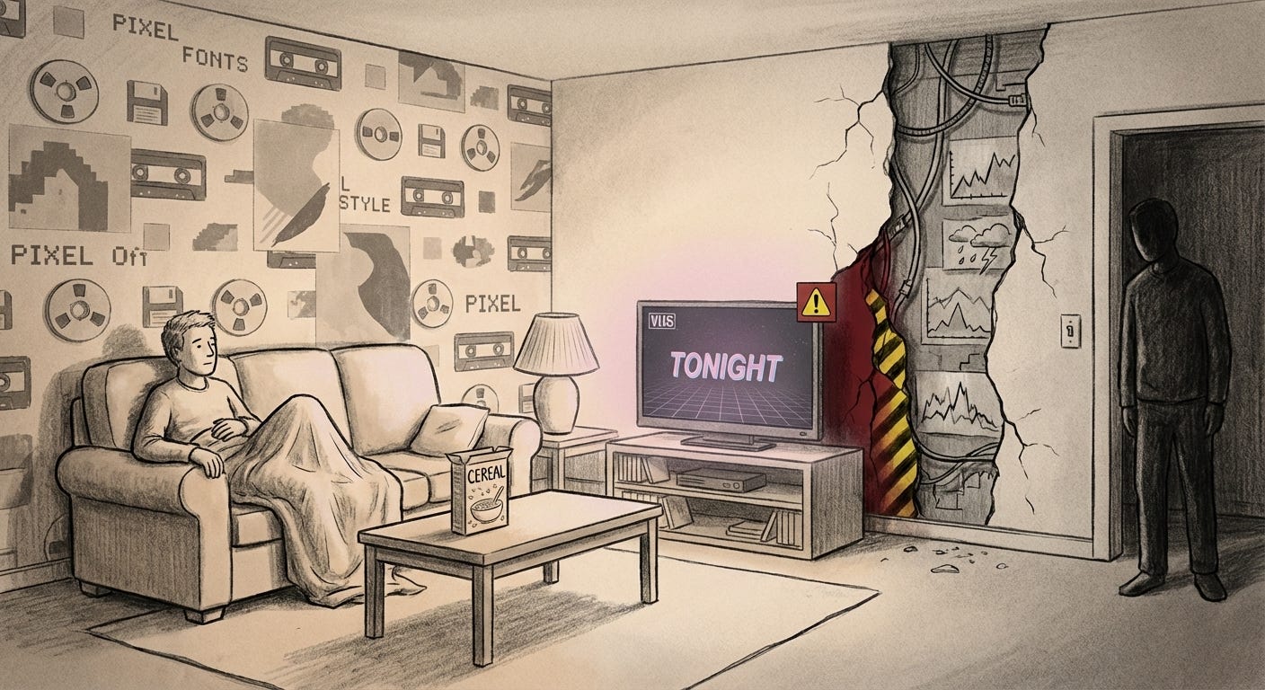
Nostalgia turns into a kind of psychological wallpaper. It keeps the room feeling familiar while the wiring changes behind the walls. The more we live inside these softened scenes, the harder it becomes to feel the specific texture of now. Distinct events flatten into one long, warm-toned memory.
For those already insulated by money, status, or geography, this is another layer of padding. The same filters that make a banking app feel like a toy also make systemic risk feel like a style. For those living without that buffer, nostalgia-heavy design can feel like gaslighting. A rough present dressed as a good old day that never arrived for them.
In the end, wraparound nostalgia trades precision for comfort. We lose some ability to feel what is actually happening in exchange for the sense that we have seen it all before and survived. The noise is not gone. It is just turned into a hum in the background.
The past is now a sound effect we pipe over the present so that it feels less like a live broadcast and more like a rerun.
Visual archive → afterimage
You’re reading Anaesthetik. The connection got louder. We feel less.