

Moodboard Theology
In Mood We Trust

We click Save on yet another inspiration image, pinning it to a digital board. A serene living room, a brutalist facade, a faded Polaroid scan. Each new addition feels routine. Yet in the quiet glow of our screens, this small gesture takes on a quiet weight. A moodboard is not just a collage of visuals; it is a wordless creed.
A moodboard is a belief system arranged as pictures.
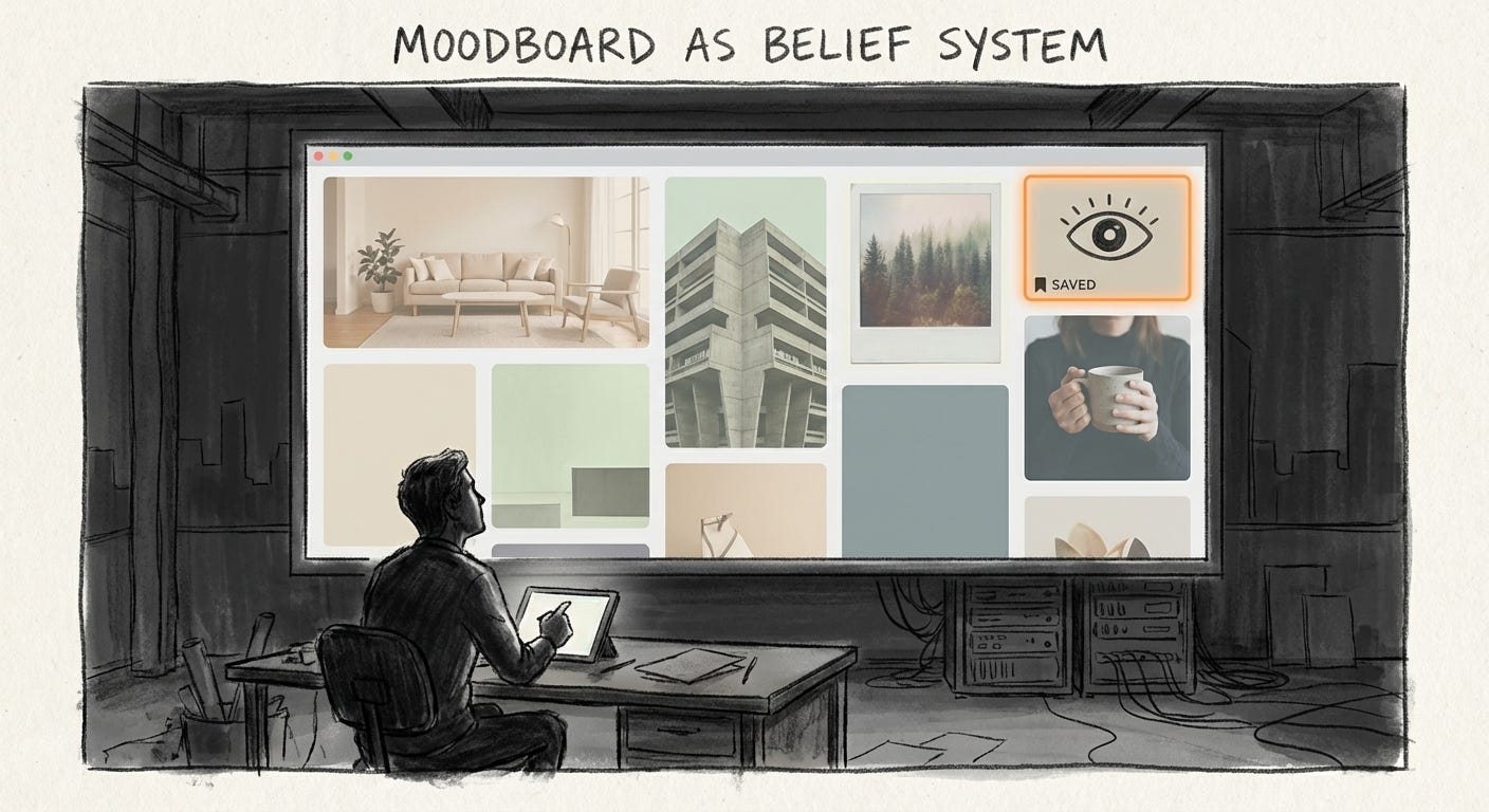
We collect, sort, and arrange until a certain world begins to feel inevitable. This is what good looks like. This is what honest feels like. This is the life our brand will promise, even if few people inside the company live anything close to it.
Rituals of belief
In branding and design, the moodboard has become a ritual of belief.
Teams assemble clusters of images on Pinterest, Figma, Notion, or internal decks not only to guide a visual direction, but to swear loyalty to an aesthetic ideology. Each reference photo and color swatch is a symbol, chosen to embody the lifestyle or values a brand wants to project.
Saving an image of sunlit wheat fields and muted ceramics quietly declares faith in a slow living, earthy ethos. Dropping a screenshot of a bare bones 1990s web page into a startup’s deck signals devotion to a certain kind of tech honesty. The board does not simply say, “Here is our style.” It says, “Here is the world we choose to believe in and sell.”
Inside the studio, that belief is comforting. The board promises alignment, shared direction, a way to avoid messy disagreement. Outside the glass, for the people who will eventually live under these aesthetics, the board sets expectations for how sincerity, truth, or authenticity should look, long before anyone has to prove them.
Palettes as doctrine
Consider the wellness industry.
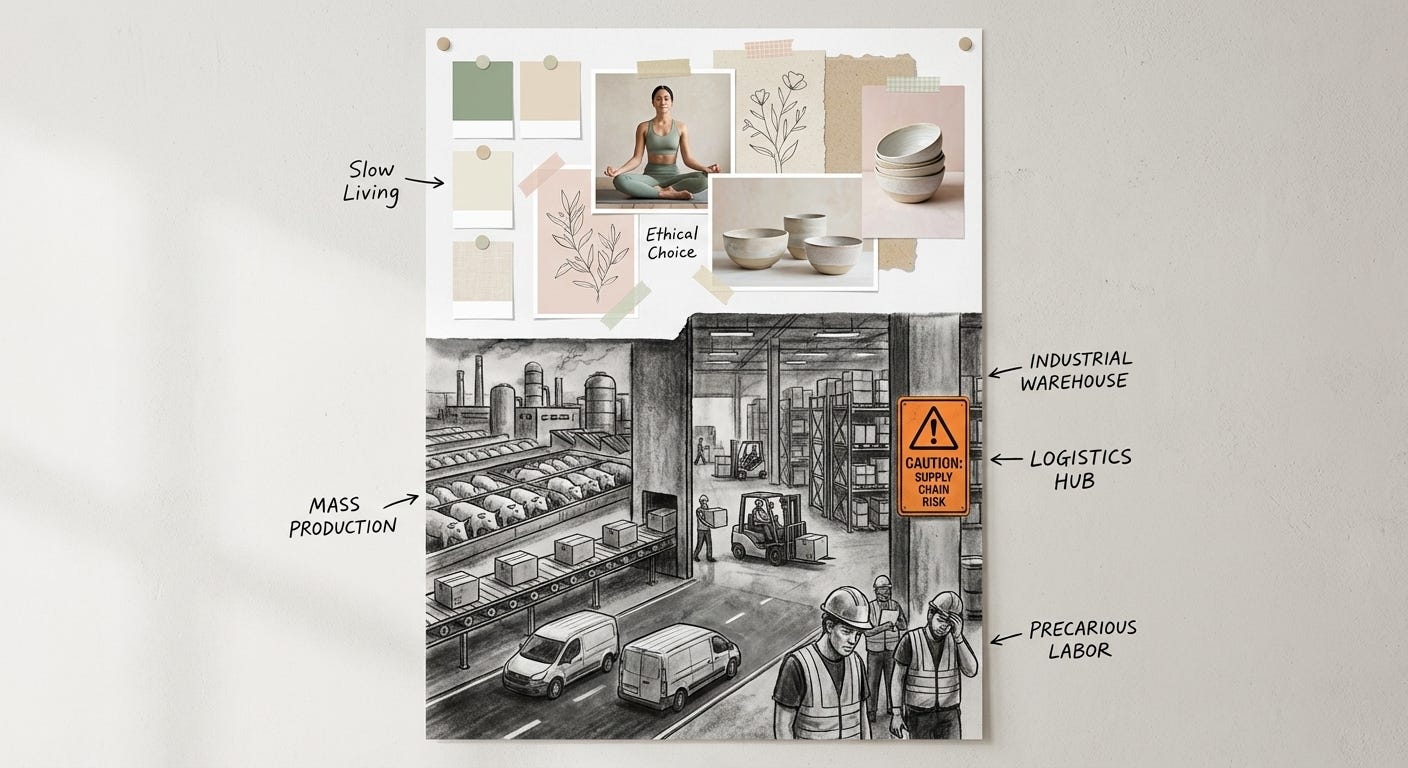
Many modern wellness brands default to moodboards of sage greens, soft browns, and creamy neutrals, with botanical drawings and linen textures floating between them. The aim is not just to look calming. It is to proclaim a return to nature, to suggest that the brand is grounded, sustainable, and kind.
Brand strategists describe these earthy palettes as feeling safe, stable, and connected to nature. The visual code quickly hardens into doctrine: muted green means holistic, uncoated ceramics mean honest, recycled paper textures mean ethical. A pitch deck for an organic skincare line can spend entire slides on wild herbs, hand thrown pottery, and people meditating in dappled light.
This is less a mood and more a liturgy. The moodboard declares that the brand lives close to soil and slowness, even if the actual supply chain runs through industrial farms, outsourced factories, and precarious gig labour. The comfort is for the customer who can afford the product, not for the workers whose own lives rarely resemble the serene scenes on the board.
Rawness as confession
Now look at digital brutalism in tech.
In reaction to glossy interfaces, some agencies and startups proudly share moodboards of bare HTML pages, default typefaces, and unstyled app screenshots. Their references borrow from brutalist architecture and early web aesthetics: stark grids, flat backgrounds, raw components that look barely finished.
On the surface, this is a stance against polish. Brutalist digital design is framed as an ethic of honesty and transparency. Stripping away gradients and soft edges becomes a badge of truth telling. The message is simple: we care more about function than appearances, we have nothing to hide.
In practice, this is another belief performed through style. The brutalist moodboard reassures founders and clients that they are serious people doing real work. It also lets a well funded startup cosplay as scrappy and unvarnished while still moving carefully within safe, familiar tropes. The interface may look raw, but the risk is tightly managed. Nothing on the board ever shows the full tangle of data collection, moderation, or outsourcing underneath that supposed honesty.
Nostalgia as proof
A third zone is nostalgia.
Branding teams increasingly cover their boards with vintage Polaroids, retro color blocks, and old typefaces. These boards trade on a shared yearning: the belief that touching the past will make a brand feel more genuine now.
Faded tones and analog textures stand in for trust. Polaroid style imagery, with its soft vignettes and warm hues, is treated as a shortcut to sincerity and slowness, an antidote to the sharpness of digital screens. A new café borrows mid century diner references. A fashion label channels early 2000s graphics. The moodboard becomes an ideological collage that says: we come from somewhere real.
But the past being quoted is carefully edited. No cramped apartments behind the diner, no boring office work behind the 35mm snapshot, no politics, no mess. Only the mood survives. Nostalgia becomes a kind of visual insurance policy. The brand promises that if it looks like the old days, it must share their supposed honesty, even if the business model is pure platform capitalism and short term contracts.
When style turns into creed
When moodboards double as belief systems, something is quietly lost.
By translating complex identities into flat aesthetics, brands risk reducing meaning to surface. The nuance of a story or mission gets compressed into familiar shortcuts: earthy tones equal pure, brutalist layout equals truthful, pastel vintage equals authentic. Repeated often enough, these shortcuts start to feel like common sense.
As more teams reach for the same reassuring visual codes, the landscape drifts toward a single, safe middle. Agencies talk openly about homogenisation of the brand world. We see it in our feeds: the same airy living rooms, the same bold sans serif on white, the same film filtered frames repeating in slightly altered forms. What once felt like a visual manifesto becomes a chant.
This is not only an aesthetic problem. It shapes who gets to experiment and who cannot. A young brand under financial pressure cannot usually afford to look strange or abrasive, so it leans on familiar boards that feel fundable. The moodboard becomes a risk management tool. Investors recognise it. Consumers recognise it. It reassures everyone except the people who might have wanted something different.
The quiet theology of taste
Design choices, repeated until they harden into doctrine, numb perception.
The first time you see a moodboard that perfectly fuses images and lifestyle, it feels like stumbling into a small religion of taste. The hundredth time, it barely registers. Emotion gives way to recognition. We learn to read the code of sage, beige, or high contrast black and white, and we stop asking what any of it actually stands on.
The moodboard promises feeling on our behalf so we do not have to feel as much ourselves.
Perception narrows to the tunnel of the chosen aesthetic, filtering out any detail that does not belong. Faces disappear. Labour disappears. Power disappears. What remains is a beautiful arrangement of symbols that say all the right things and touch us only lightly.
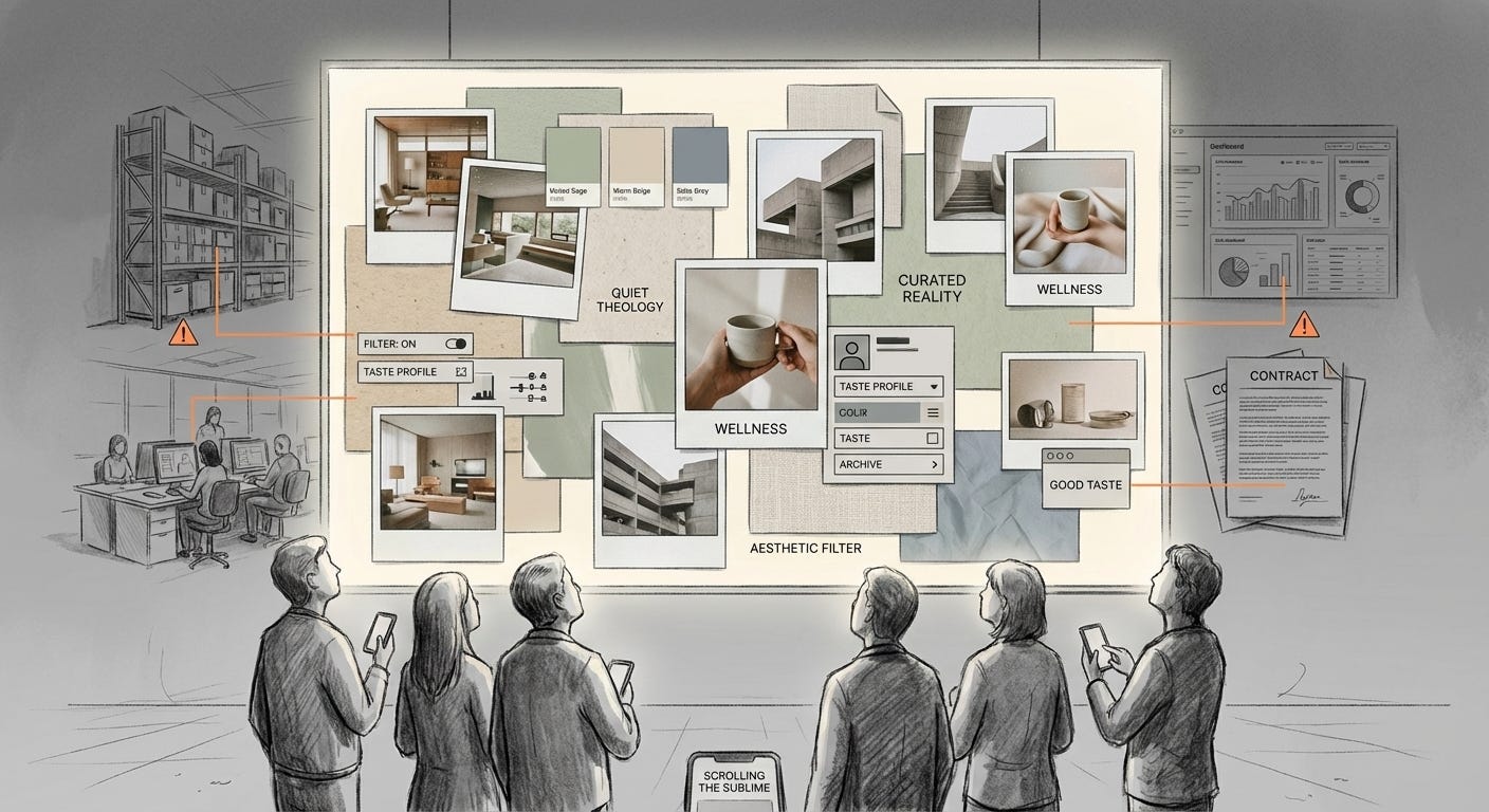
We keep clicking Save, adding images to our private and collective boards, building careful theologies of mood that make the world smoother to look at, and a little harder to feel.
Visual archive → afterimage
You’re reading Anaesthetik. The connection got louder. We feel less.