

Gentrified Brutalism
Everything Gets Loud

Brutalism used to feel like a dare.
Now it feels like a backdrop.
Concrete that once signalled austerity, mass housing and public institutions has slipped into the realm of taste. The same heavy forms now live in museum foyers, luxury condos, and fashion campaigns. The geometry has not changed much. The class story around it has.
Concrete as status symbol
Brutalist architecture began as a kind of honesty. Materials were left exposed. Structure was visible. Surfaces showed their seams and stains. It was cheap, practical, and often tied to public housing and civic projects. The roughness was not a flourish. It was a budget.
That same roughness is now sold as depth.
In a culture flooded with smooth, replaceable objects, raw concrete reads as proof of seriousness. One real-estate feature described bare concrete as a counter-narrative to “mass-produced, transient design,” casting it as a sign of durability and authenticity. The mood is simple: when everything feels fake, heavy walls look like truth.
The route from defiance to décor is familiar. First, architects or artists use raw forms as protest, experiment, or sheer necessity. Then media and tastemakers frame this look as striking and new. Finally, marketers extract the visual language and turn it into a lifestyle code. By the time it arrives in luxury retail, the original politics are mostly gone.
Museums learned this early. The Tate Modern did not cover up its former power station shell. It kept the hulking concrete intact and turned it into a brand asset. Visitors are meant to “feel the weight” of the building as they enter. Raw walls, exposed structure, and wide empty halls work as a visual system that says: serious culture happens here.
What began as infrastructure becomes atmosphere. The bunker becomes a credential.
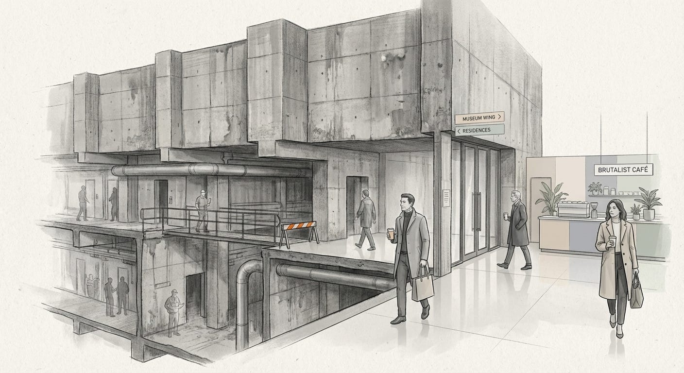
Brutalism did not soften.
Our uses for it did.
From welfare block to lifestyle shell
The clearest shift sits in housing.
Brutalist estates were often built for people who could not afford more forgiving architecture. The concrete was cheap to pour. The repetition kept costs down. Whatever poetry existed in the forms was secondary to the function: bodies needed walls.
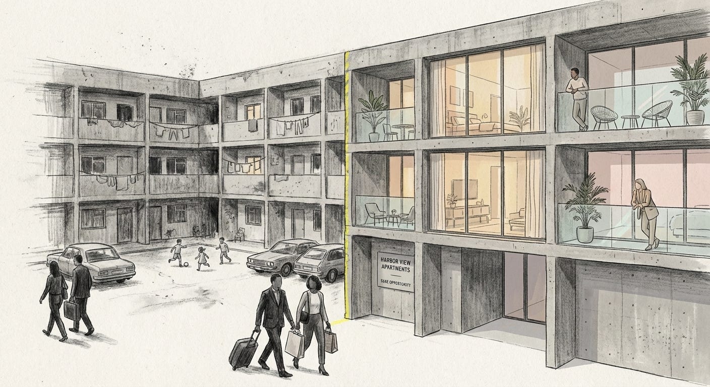
Decades later, the same buildings are reappraised as sculptural icons. In Sydney, the Sirius apartments began life as public housing, a stack of concrete boxes looking over the harbor. When the block was cleared and sold, listings suddenly praised its “solid, sculptural” presence. The look that once signalled social housing was relabelled as rare and Instagram-ready.
Inside the glass, the view and the patina are now luxuries. Outside the glass, former residents are pushed further out into cheaper, more fragile stock. The concrete did not move. The class boundary did.
Museums follow a softer version of the same pattern. The Tate’s preserved roughness helps visitors feel adventurous without ever being unsafe. You can enjoy the thrill of industrial scale with none of the precarity that comes with working inside an actual plant. The building’s past life is there as texture, not as risk.
In both cases, the aesthetic of toughness provides comfort to people who no longer live with its consequences.
Boutiques in bunker drag
Fashion and interiors have taken that comfort and made it portable.
Luxury brands now stage shows and stores in spaces that could easily double as car parks: bare concrete floors, bent steel, minimal fixtures. One New York label built a SoHo store around visible marks in the concrete so that the room would feel textured and “honest.” The architect framed this reduction as real luxury: remove adornment so buyers can “focus on the clothes.”
The result is a mood of disciplined scarcity. Everything looks stripped back, almost severe, yet every detail is tightly controlled and absurdly expensive. The unfinished wall is not a cost saving. It is a design decision that signals restraint to people who can afford excess.
A similar tone runs through the “corporate fetish” trend in fashion shoots. Runways and campaigns borrow the visual language of fluorescent-lit offices and dull boardrooms. Ceiling tiles, pale walls, and cheap blinds become props. The boredom of office life is not escaped but re-staged as ironic chic: a costume for those who can leave at any time.
Soft touches reassure. Plants, warm wood, and careful lighting keep the brutalist shell from feeling truly brutal. This is brutalism with a concierge, bunker drag with good coffee.
Digital concrete
Online, brutalism has been flattened into a graphic style.
Around a decade ago, some web designers rebelled against hyper-polished interfaces by publishing deliberately “broken” sites: default fonts, clashing colors, blocky layouts that felt stubborn and wrong. The idea was to resist the smoothness of corporate UX, to remind visitors that a website is built, not inevitable.
The rebellion did not last long. Galleries appeared to celebrate “brutalist” web design. Guides explained how to use stark color blocks, heavy type, and jarring layouts to stand out in the feed. Major media brands joined in. Bloomberg relaunched with huge, misaligned headlines and raw interface elements. Adult Swim rolled out a chaotic, almost unreadable homepage.
The original oppositional energy was quickly folded back into the logic of attention. “Brutalist” layouts became one more way to look edgy while playing the same engagement game.
Packaging has followed. A cannabis brand, for example, used rigid color blocks, blunt typography, and simplified slabs of shape to nod at 1950s monuments. Concrete became an icon you could hold in your hand, a memory of weight printed on cardboard.
What once pushed against consumer culture is now a premium style on the shelf.
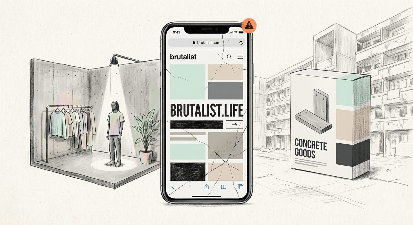
When concrete turns into a filter,
the heaviness stays while the history drains out.
What gets erased
The new brutalism is strangely polite.
Domus once noted that “brutalist” now often just means something bold and concrete in look, with little interest in the social projects or failures it came from. Scroll the #brutalism tag and you see fashion shoots, museum atriums, boutique hotels, tech offices. You rarely see overcrowded estates or decaying public blocks.
Anxiety is managed away. Potted plants soften the corners. Warm bulbs wash the grey in amber. The materials stay cold, but the mood does not. You are meant to admire, not to ask who used to live there or what was demolished to make room.
For people on the inside of these spaces, brutalism offers a thrill of hardness without real exposure. It lets you borrow the look of struggle as a kind of armour. For those pushed out, the same forms can read as a reminder that even their old aesthetics have been taken, refurbished, and priced up.
Brutalism once carried a question: who is the city being built for. Gentrified brutalism changes the question. It asks how much atmospheric seriousness you can afford.
The concrete is still honest about what it is.
We are less honest about what we use it for.
Visual archive → afterimage
You’re reading Anaesthetik. The connection got louder. We feel less.