

Framing Crises with Calm Language and Imagery
The Polite Apocalypse

The news rarely screams anymore.
Even when the world is on fire, the page stays tidy, the anchor’s tone remains level, the colors soothe.
Calm is presented as responsible. It is also a filter on what we are allowed to feel.
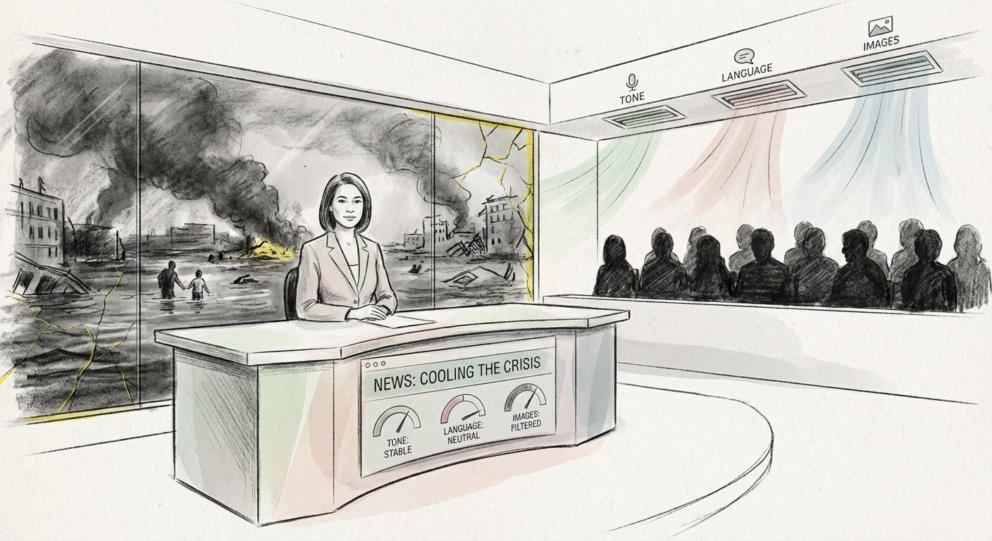
News as Emotional Air Conditioning
Mainstream outlets manage public mood as much as they manage information.
Reporters and editors choose words that lean away from panic. Crises are wrapped in neutral, almost bureaucratic language. Television news keeps a light, conversational tone that Columbia Journalism Review once called “happy-talk,” even when the subject is bleak. Calm is treated as professionalism, while alarm is treated as bias or hysteria.
This creates a strange double movement.
On the surface, it looks like restraint and rigor. Underneath, it works as emotional air conditioning for whole societies. It keeps things cool enough that nothing boils over. It protects institutions from the full force of public fear and anger.
The pattern shows up wherever the stakes are highest: climate, economy, social breakdown. Each time, the same trick repeats. Words and images are selected not only to describe reality, but to make that reality easier to live with, especially for those already in charge.
Calm is treated as a virtue of journalism, even when it functions as a shield for power.
The Trick of Soft Language
Climate is the clearest example.
For years, most outlets have preferred the phrase “climate change.” It sounds slow, almost seasonal. Editors at the Guardian later admitted it felt “passive and gentle” compared to what scientists were actually describing: catastrophe, breakdown, emergency.
When the Guardian decided in 2019 to shift its style guide toward “climate crisis” and “climate emergency,” the move exposed how entrenched the softer wording had become. Some public broadcasters quietly reviewed their own usage. Many US papers did not change much at all. The default stayed with “change” and “warming.”
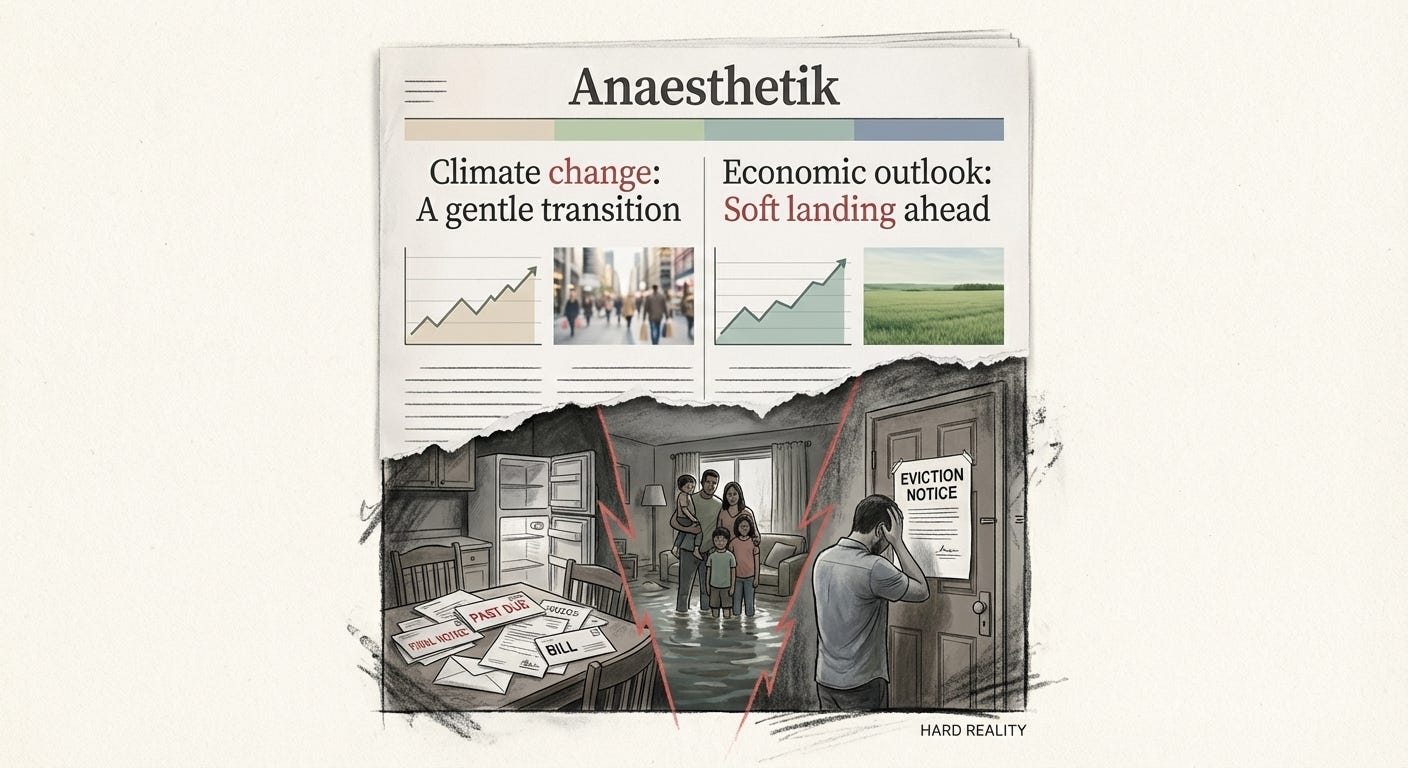
The word choice matters. “Change” suggests continuity and adaptation. It makes disaster sound like a slightly warmer version of what we already know. It helps readers keep living as if the system is basically intact.
Economic reporting follows a similar line.
A recent Associated Press story on US inflation framed events as a success story. The central bank had “essentially defeated” high inflation, and the economy had achieved a “soft landing.” The article highlighted macro indicators: no technical recession, low unemployment, inflation near target. Everyday images of shoppers and commuters reinforced a sense of normal life.
Only later in the piece did the voices of ordinary people appear, still struggling with the price of food, rent, fuel. Their difficulty was acknowledged, but weighed against the bigger story of institutional competence. The overall mood: things have been managed.
Soft language does not erase harm. It relocates it. The system is presented as stable and well handled; the instability is pushed down into households and neighborhoods.
Designing Distance: Images, Layout, Tone
The calming effect is not only verbal. It is visual.
Climate coverage has long favored abstract or distant imagery: polar bears, glaciers, empty forests, smokestacks in the haze. Guardian editors have admitted that these visuals make the crisis feel remote and non-human, something happening “out there.”
Communication researchers point out that people react more strongly to human faces and local scenes. Flooded streets they recognize. Families on rooftops. Cracked farmland in regions that look like theirs. Yet the default image remains the symbolic bear, the anonymous ice sheet.
The same happens with economic stories. Instead of overcrowded food banks or eviction notices, we often see stock photos of shopping bags, traders at screens, or smiling politicians at press conferences. The page stays tasteful. The pain is implied, not shown.
Design choices support this distance:
muted color palettes instead of urgent red
sober typography instead of alarm graphics
serious stories tucked under calm headlines, without “breaking” banners or visual noise
None of this is accidental. News brands are very sensitive to their own tone. Alarm graphics are reserved for spectacular events: terrorist attacks, coups, dramatic elections. Slow, grinding crises like climate or long-term cost of living are handled with a cooler aesthetic.
This coolness comforts investors, advertisers and policy makers. It reassures middle-class audiences that institutions are in control. The people who do not get comforted are those already living in the crisis.
When disaster becomes a design problem, the priority quietly shifts from feeling it to absorbing it.
Case Study 1: Climate as “New Normal” in Pakistan
In Pakistan, the newspaper Dawn ran a striking front page on record hailstorms in 2025. The headline spoke of a “freak hailstorm” and “climate chaos fast becoming our new normal.” The photos showed golf-ball hail, flooded streets, real damage.
At first glance, this looks like the opposite of soft-pedaling. The language is dramatic, the imagery visceral.
Look closer at the phrase “new normal.” It admits escalation, then folds it back into routine. Chaos is repositioned as something to live with. The storms are rendered as inevitable weather events, not as the outcome of specific political and economic decisions: weak infrastructure, planning failures, global emissions, unjust adaptation financing.
Media analysis of this coverage found a pattern:
repeated use of phrases like “another round” of bad weather
minimal attention to responsibility or policy
affected communities described as passive victims of nature
Over time, this repetition matters. People are trained to expect devastation as part of the background. The hail becomes something that simply happens to them, not something that could be changed by different priorities.
Fatalism is a kind of calm too. It is the calm of powerlessness.
Case Study 2: Western Climate Language and Public Skepticism
In North America and Europe, the language game has a different twist.
On one side, some outlets cautiously adopt stronger terms like “climate crisis” or “climate emergency.” On the other, many readers say in interviews that this language feels like “hype” or agenda-driven fear. Pew Research interviews in the US show a common pattern: when people hear repeated use of “crisis,” they start to doubt the messenger rather than the message. They say they prefer “factual” statements from scientists.
The result is a stalemate in perception.
Editors fear sounding hysterical, so they stick to neutral words and a soft tone. Activists and some journalists push for stronger language, which then triggers skepticism about bias. Meanwhile, the imagery does not change much. Articles still lead with distant landscapes or generic smog, reinforcing the sense that climate is primarily an environmental issue, not deeply social and economic.
This stalemate benefits stability. It keeps climate on the horizon instead of in the living room.
People who are already secure can treat the crisis as a topic to follow, a policy debate to track. Those directly affected have little say in how their reality is framed. Their urgency is diluted into a polite argument about wording inside newsrooms and think tanks.
Case Study 3: The Gentle Economics of a “Soft Landing”
The Associated Press inflation story shows how economic pain is reframed as success.
From the perspective of central bankers and markets, a “soft landing” is an achievement. Inflation has come down without mass job losses. The article gives generous space to this narrative, quoting the Fed chair and highlighting the outcome in careful, almost proud language.
For households living on tight margins, the story looks different. Prices rose sharply and stayed high. Inflation slowing does not reverse the damage. Wages did not leap to match earlier spikes. Everyday life became more expensive and remains so.
The coverage acknowledges this disconnect, but as a secondary note. It reads more like a mood mismatch than a structural problem. The system is described as basically healthy; the people’s disappointment is almost framed as a failure to appreciate the macro picture.
Here, calm language, gentle layout and reassuring images do a particular kind of work. They preserve trust in monetary authorities and political leadership. They encourage a sense that the worst is over and that responsible adults have handled it.
The cost of that reassurance is the lived experience of those who do not feel any relief at all.
Numbness as Policy Outcome
When crises are framed in soothing terms, two things happen at once.
First, the privileged are shielded from the full emotional weight of collapse. They can continue to invest, plan, and govern inside a story where things are under control. Their anxiety is managed by careful language and tastefully distant images.
Second, those already exposed to risk are made to feel that their suffering is normal, inevitable or even invisible. The language of “new normal,” “soft landing” and “change” all push in the same direction: accept, adapt, do not expect too much.
Over time, this combination produces numbness.
We scroll past climate disasters that look like stock photography. We skim stories of economic hardship framed as temporary turbulence in an otherwise impressive recovery. We absorb the mood of calm more deeply than any specific fact.
The numbness is not a side effect. It is part of how power reproduces itself in an age of permanent crisis. If people felt the full intensity of what is happening, they might demand structural change that threatens existing arrangements. Calm coverage keeps that possibility at a safe distance.
In a world of managed crises, feeling less becomes a feature, not a bug.
Comfort as a Way of Forgetting
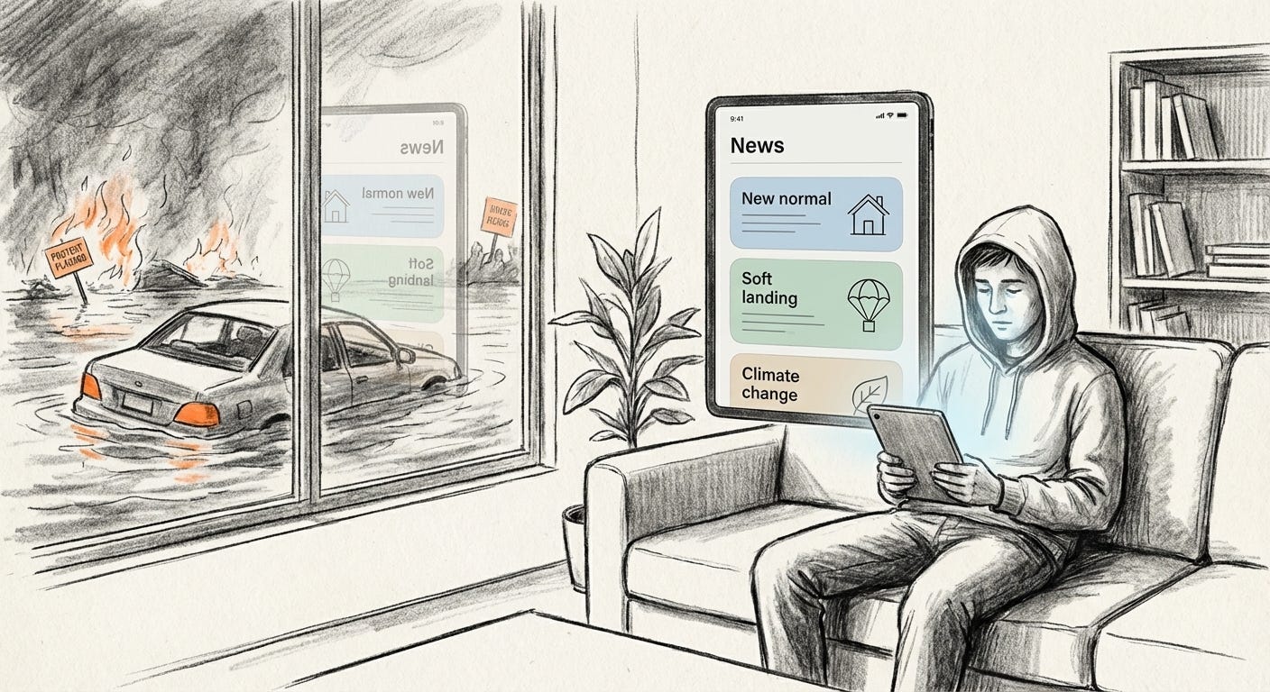
Calm language and gentle imagery carry an implicit promise: you do not have to panic. Things are being handled. Disaster is either far away, under control, or simply the way things are now.
For those on the inside of the glass, that promise is comforting. For those outside, it is a quiet erasure.
The more the system relies on these techniques, the more honesty begins to feel impolite. Calling something a catastrophe instead of a change sounds extreme. Showing the real human cost looks like bad taste. The aesthetic of moderation protects the very structures that are producing the emergency.
In that sense, the crisis is not only out there in the world. It is in the way we are allowed to see it.
Visual archive → afterimage
You’re reading Anaesthetik. The connection got louder. We feel less.