

Content That Refuses to be Content
Algorithmic Resistance on Social Media

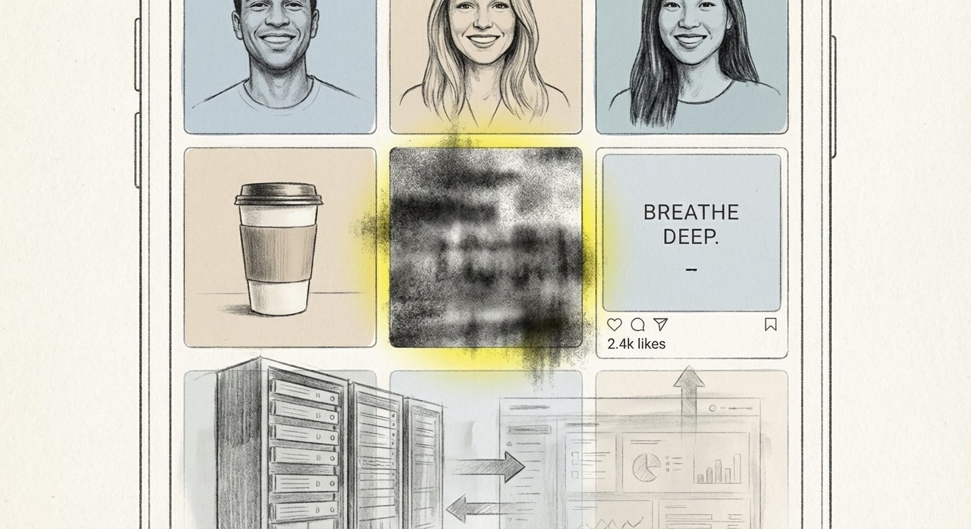
Social feeds prefer what is legible. Smooth faces, clear hooks, quick jokes, easy outrage.
Yet in the same grids, another image keeps appearing. Blurry, badly compressed, unemotional or strangely emotional. It looks wrong, and that is the point.
This is algorithmic resistance at the level of pixels. Not by logging off, but by posting work that refuses to play by the usual rules of clarity and polish.
The optimization trap
Social platforms reward content that the system can read. Clean subjects, stable moods, familiar formats. Engagement is the measure, so anything that is easy to classify and route forward tends to win.
Design culture adapted to this logic fast. Creators learned to keep things bright, sharp, and emotionally clear. The result is a shared visual language that passes smoothly through the feed and into the ad system, comforting brands and platforms alike.
Against this, some artists and meme makers follow a different instruction set. They post low resolution, confusing, or formally “bad” images. They treat constraint and misfit as materials.
Art critics have noted that digital platforms already favor certain kinds of “poor” images, built for speed and spread rather than refinement. Artists like Vuk Ćosić argue that this is where resistance has to begin: refusing the neat optimization loop and insisting on “aesthetic freedom” even inside it.
A mood that confuses the algorithm can feel like the last honest gesture left online.
Cursed images: confusion as a club
Cursed Image Dealer on Instagram is a clear example. The feed is full of photographs that feel like a headache you cannot explain. An elderly woman asleep under a ceiling crowded with crucifixes. A hallway lit like a horror set but clearly someone’s home. Everything is a little too grainy, too strangely framed, too unresolved.
The account’s anonymous curator chose “cursed” images as a niche precisely because it was underexposed. No clever text overlays, no affirmations, no clear takeaway. In interviews they explain that the appeal is simple: you look, you feel a small spike of fear or confusion, and that is enough. The image refuses to tell you how to feel about it.
On a platform built around aspirational lifestyle and clean branding, this is a kind of structural joke. The page violates Instagram’s grammar of polish and positivity. It gained a cult following anyway. Meme pages and underground artists followed. The comments turned into small rituals of shared discomfort: everyone trying to name what is wrong in the picture, no one quite getting there.
Inside that success is a cost. These posts do not lean on trending audio, clear keywords, or high-energy emotion. They are hard for the recommendation system to classify and may be hard for casual viewers too. The account trades reach and clarity for a specific kind of insider vernacular. If you get it, you stay. If you do not, you scroll.
What looks like an aesthetic choice is also a class of access. It takes time and a certain security to run a page that might never fully “hit” the metrics the platform suggests you chase.
Weirdcore: nostalgia for nothing in particular
On Tumblr and TikTok, Weirdcore and related styles like Dreamcore push this logic further. A bland early-2000s kitchen. A naive animated burst pasted on top. Blue text that reads “baby it’s going to be ok” in a way that somehow feels threatening. The images look like they were made with the wrong tools, by the wrong person, at the wrong time.
Commentators describe Weirdcore as an internet-native movement that uses digital collage to evoke confusion, disorientation, alienation and a strange nostalgia. The nostalgia is not for a specific event. It is for a vague sense of “before”. Before social media, before adulthood, before the current crisis you are in.
The pieces often refuse narrative. They place the viewer in a setting that seems familiar, then withhold enough context that no stable story can form. A hallway with a single glowing word. A playground with sky replaced by static. Domestic comfort paired with text that sounds like a threat, or vice versa. You are invited to feel something, but not told what.
Weirdcore turns the absence of a clear story into the story.
From the system’s perspective, this is noise. There is no obvious emotion to tag, no clean category to match. Yet these images travel widely under hashtags that suggest a mood rather than a topic. Viewers treat low fidelity as proof of authenticity. Grain, blur, primitive type, and obvious compression feel more “true” than stock-like clarity.
Art historians have linked this to a wider distrust of high definition. Perfectly rendered images feel corporate, engineered, possibly generated. Something “less processed” reads as more human. Weirdcore leverages this sensory bias and turns it into community. The ambiguity becomes a shared code: if the image makes you uneasy in the right way, you are in.
Again, there is a divide in who can move through this world. For many users, feeds are survival tools for visibility, income, or activism. Vague, unreadable work is a luxury they cannot afford. For others, especially those not dependent on the algorithm for rent, confusion can be a playground.
Ugly ads: resistance absorbed
Where there is attention, advertising follows. Marketers have noticed that people have learned to ignore clean, glossy ads. Banner blindness extends to anything that looks too much like a campaign.
Industry reports now talk about “ugly ads”. Deliberately low-fidelity spots with crude animations, awkward type, shaky camera work, or clashing colors. They read like mistakes. In performance dashboards, they often win.
The logic is blunt. In a scroll of polished content, something that looks wrong interrupts the reflex. Viewers pause, comment, or share. The ad exploits the same algorithmic quirk that cursed images and Weirdcore use. Imperfection trips the sensors that measure engagement.
Corporations have turned this into a tactic. The raw look is no longer just an underground aesthetic. It is a line item in the media plan. The “uglier side of things” becomes a growth hack, not a critique.
What began as resistance to optimization is reabsorbed as a new form of optimization. The system learns that roughness works and starts to prefer a certain kind of roughness. The aesthetic of refusal is packaged and sold.
The cost of misfit
Posting unreadable or low quality images is not a neutral experiment. There are social and emotional costs.
For creators, there is the stress of working against the grain of the platforms that host their work. Accounts built on confusion and discomfort draw devoted but demanding audiences. Managing their expectations, arguments, and interpretations can be draining. It is not the clean arc of viral success, it is a constant negotiation of meaning.
There is also the risk of being misread. Cryptic or disturbing posts can be dismissed as edge for edge’s sake. They can be flagged, shadowed, or quietly deprioritized by moderation tools trained on clearer categories of harm. People outside the subculture may feel pushed away by the lack of obvious emotional cues.
In terms of power, the key asymmetry is simple. Not everyone can afford to “leave money on the table” in visibility. To treat reach as optional, you usually need some other base of security. Algorithmic resistance, in this sense, is not just an artistic stance. It is a position that rests on class and context.
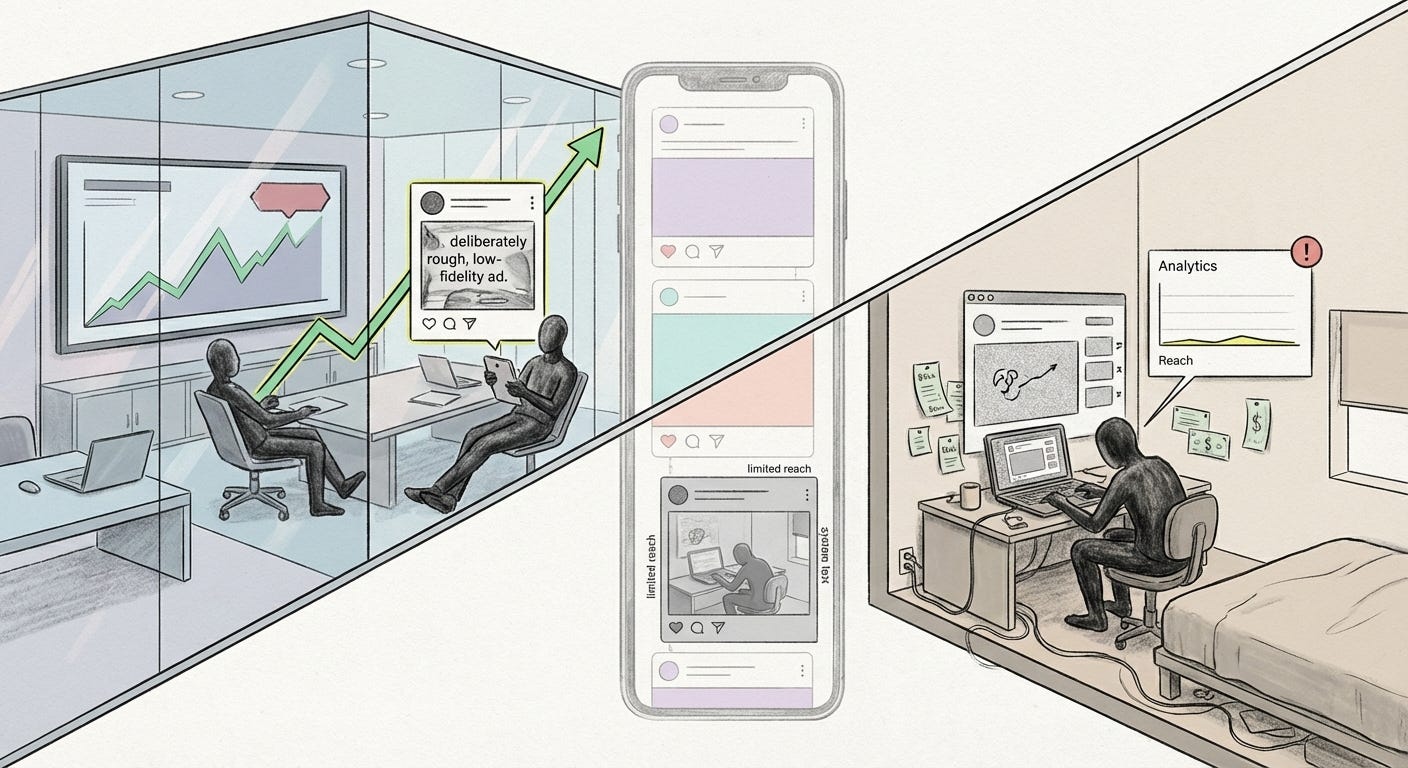
Those already inside stable institutions or income streams can risk obscurity. Those outside often cannot.
Writers like Kyle Chayka have argued that opting out of algorithmic smoothness is a way to develop personal taste again, to see art that the feed would never volunteer. The same is true for making it. For many artists, breaking from trends and embracing raw, unrefined aesthetics is less a career move and more a survival strategy for their own sense of self.
What misfit makes visible
These low-fi, confusing, and “ugly” images do not overthrow platforms. They do not stop recommendation engines from doing their work. But they reveal the contours of that work.
They show which moods are easy for machines to route and which are dropped. They expose how quickly genuine weirdness is copied into brand decks. They signal the gap between those who need the algorithm and those who can afford to provoke it.
Most of all, they remind us that there is still space, even if small, for images that resist complete understanding. Pictures that slow the scroll instead of smoothing it. Pictures that, for a moment, do not comfort anyone in particular and cannot be used to sell.
Sometimes the only way to feel outside the system is to post something it cannot fully read.
Visual archive → afterimage
You’re reading Anaesthetik. The connection got louder. We feel less.