

Calming Visuals and Hidden Manipulation
Juxtapose of intention

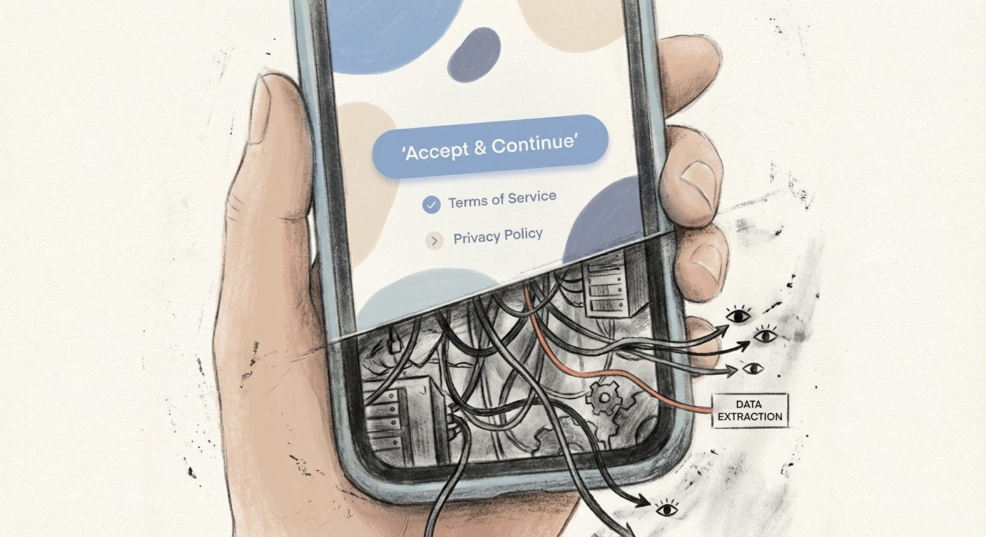
Soft blue button. Rounded corners. A sentence that sounds more like a reassurance than a request.
Before you even read the words, your body has already relaxed.
On screens, that relaxation is not neutral. It is often the point.
The soothing script
Neuroscience has been mapping this terrain for years. Curved shapes feel safer than sharp ones. Pastel shades signal friendliness and low threat. Reds and hard angles, by contrast, push us into vigilance. Designers know this, whether from formal research or learned instinct: soft shapes and gentle hues quiet the nervous system.
In many interfaces, that quiet becomes a strategy.
“Calm” UX borrows the language of care but often serves the needs of data extraction. Minimal text means fewer alarming details. Rounded corners soften the presence of serious choices. Pastel or branded blues frame risky consent as routine housekeeping.
What should feel like a contract starts to feel like a friendly tap.
Calm design does not lower the stakes.
It lowers suspicion.
The result is a kind of aesthetic anesthesia. We feel reassured and slightly numbed at the exact moment we should be awake, choosing whether or not to be watched.
Evidence in the wild
The pattern is easier to see when we zoom in on specific screens. Four examples from the past decade show how serene visuals and soft microcopy sit on top of hard, structural decisions.
Facebook: the pretty path to “Accept”
When GDPR arrived in Europe in 2018, Facebook had to ask users to review their data settings. The legal stakes were enormous. The interface did not look that way.
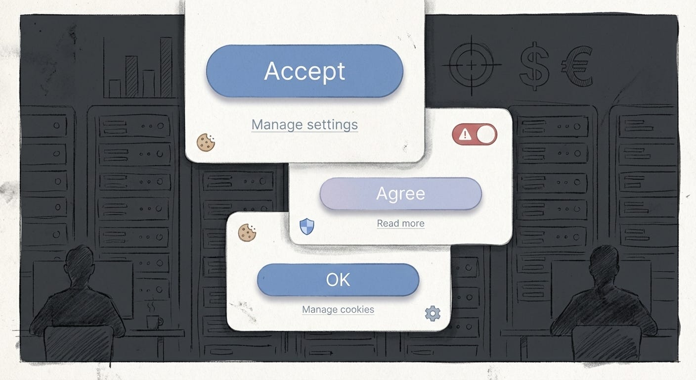
On the “Review Your Data Settings” screens, the main action was a large, saturated blue button with copy that sounded conclusive and safe: “Accept” or “Agree and Continue.” Next to it sat a smaller, grey “Manage Data Settings” option that looked like a secondary link rather than the real control surface. Choosing that quieter option led into a maze of additional steps and submenus.
The visual hierarchy did the persuasion. Blue was comfort and continuity. Grey was doubt and effort. Journalists at the time described the flow as designed to make people breeze through, and that was precisely the effect: a gentle, visually pleasing journey that ended in broad tracking and ad targeting as the default.
On the surface, this was “calm” design. Underneath, it was a system protecting an advertising engine worth billions. The people who benefited most were far from the screen: ad buyers, shareholders, executives. The people tapping the blue button traded away granular control over their data in seconds.
WhatsApp: consent hidden in the fine print
In 2016, WhatsApp introduced a privacy update that would share user data with Facebook. The update dialog did not foreground this fact.
The main pop-up highlighted benign features and improvements. It framed the change as part of making the service better. A large, welcoming Agree button dominated the screen. Somewhere in smaller, low-contrast text sat a “Read more” link that quietly contained the opt-out. Only by following that path, and scrolling through additional screens, could users refuse data sharing.
Digital rights groups pointed out how few people would ever take that route. Most users simply wanted to get back to their chats. The calm wording and spacious layout signaled “maintenance,” not “policy change.”
Here the soft interface did two things at once. It protected the company’s interests in combining datasets across products. It also shifted the burden of vigilance onto the individual. If you did not notice the tiny exit hatch, that was framed as your oversight rather than a design choice.
Cookie banners that feel like housekeeping
The humble cookie banner is another site where calm visuals sit on top of aggressive surveillance infrastructure.
Take a typical fast fashion site. The banner appears at the bottom of the screen, in a muted grey or off-black. The copy is casual and unthreatening: “We use cookies to improve your experience. Click OK to continue.” Next to that line, a bold “OK” or “Accept” button stands out. The “Opt out” or “Manage settings” control, when it exists at all, is visually weaker or tucked into a secondary link.
Reporting on banners like the one used by Forever 21 has shown the same pattern. Accept is one click. Refusing means opening an additional panel, navigating several categories, and toggling off each type of tracking one by one. The design makes annoyance more likely than resistance.
The banner looks like a polite ritual of transparency. In practice, it preserves the data flows that keep ad-tech profitable. For users in precarious situations, on older devices, or with slower connections, the calculus is simple: just tap OK and move on. Time and attention are scarce; the company banks on that scarcity.
What looks like respect for your choice
is often respect for the ad pipeline.
System prompts that feel like nothing new
Even at the operating system level, privacy prompts arrive dressed in calm.
Apple’s App Tracking Transparency dialogs, introduced on iOS 14, are formally a win for user control. Apps now have to request permission before tracking activity across other apps and sites. The prompt appears in Apple’s familiar alert style: a light background, clear typography, short copy, and a blue primary button paired with a grey secondary one. Apps can add a friendly explanation about “supporting free content” or “keeping ads relevant.”
Visually, it all feels routine. This looks like every other permission request in the system. That familiarity matters. Over time, repeated prompts train us to treat tracking as just another tap on the way to what we actually want to do. Regulators in France have since fined Apple not for the look of the prompt, but for the way the overall system privileges Apple’s own ecosystem over smaller publishers. Calm privacy surfaces at the front, competitive and economic consequences behind.
The point is not that Apple uses the exact same dark patterns as Facebook or fast fashion banners. It is that a smooth, trusted aesthetic can wrap any policy choice, whether protective or self-serving, in a sense of normalcy. The visual tone says: this is just how things are done.
What calm design does to feeling
Across these examples, a pattern emerges.
Calm visuals are used at the exact moments when something non-calming is happening: large-scale data sharing, behavioral profiling, structural changes in who can see and sell our attention. The screen reassures so that the infrastructure behind it does not have to.
For people with time, legal literacy, and a stable life, there is at least the option to dig, to click the smaller buttons, to read the policy pages. For everyone else, the cost of resistance is higher. Parents juggling work, migrants navigating services in a second language, workers stuck on slow connections: for them, the calm path of least resistance is not just tempting, it is often the only realistic one.
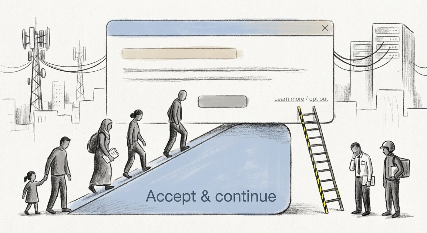
Calm design, in this sense, comforts those already inside the system and disciplines those living under it. It normalizes the idea that serious choices should feel light. It teaches us that discomfort is a user experience problem, not a political signal that something about the deal itself is off.
The quiet surface
None of this means sharp corners or loud colors would save us. The problem is not pastels versus neons. It is the use of soothing aesthetics to mask asymmetry.
When consent to surveillance is wrapped in softness, refusal begins to feel rude, almost uncooperative. That is the real manipulation at work: not only do we give away more than we intend, we do it while feeling oddly taken care of.
The screen stays calm
so the extraction can stay invisible.
Visual archive → afterimage
You’re reading Anaesthetik. The connection got louder. We feel less.