

Calm as a Design Weapon
It was subtle and sharp

How soothing visuals lower our guard while decisions are made without us.
The age of gentle design
Softness is everywhere.
Apps arrive in pastels and rounded corners. Banking tools apologize with emojis instead of red error states. Meditation screens fade in with slow gradients and polite reminders to breathe. The mood is clear: relax, you are being taken care of.
This visual language promises a more humane technology. A calmer UX is meant to reduce anxiety, ease friction, and give us interfaces that “care” about our feelings. The money app that once barked at you now murmurs “Oops, you’re running low.” The meditation app surrounds you with deep blues that make the phone feel almost sacred. On the surface, it looks like progress.
Yet something else is happening under that softness. The more the world fills with beautifully crafted screens, the less any single one of them lands. Beauty stops being an event and becomes a background condition. We scroll through an endless sequence of pleasant, considerate designs and feel strangely flat.
Beauty has become a wallpaper for power. It soothes us while the real work happens off-screen.
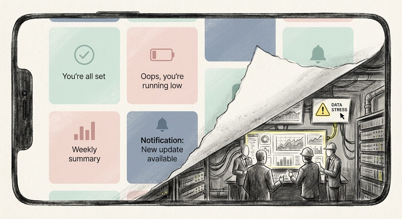
Calm design is not just an aesthetic choice. It is a control surface.
Aesthetic anesthesia
Saturation is its own kind of drug.
Our feeds serve us hundreds of pieces of “nice” content every day. Smooth UI, clever motion, comforting palettes. Each post or screen, taken alone, feels harmless. Taken together, they create a low, constant hum that our senses can no longer track.
Anthropologist Robin Dunbar once suggested that humans can maintain meaningful relationships with roughly 150 people. Platforms ignore that limit. In a single day, we hear from hundreds or thousands of accounts, brands, creators, and bots. There is no way to metabolize that much emotional input, so our systems protect us the only way they can. They flatten.
The old rhythm of seeing something, stopping, and letting it rearrange you has slipped away. Instead, we glide. The timeline never ends. There is always one more soft-edged tile of content waiting below.
Infinite scroll is sold as user-friendly. No clicking, no pagination, no effort. In practice it works like a behavioral anesthetic. By removing hard stops, it removes natural points to re-evaluate. You never encounter a moment where the interface tells you: this is a good time to leave. You simply continue, half-aware, in a visual lull designed to feel frictionless.
Calmness becomes a way to keep you from noticing what you are losing: time, attention, and the capacity to feel a difference between “this matters” and “this is just more”.
The illusion of caring UX
The language around all this is the language of care.
Design teams talk about “reducing cognitive load,” “supporting well-being,” “designing for emotional safety.” They add undo buttons, use friendly microcopy, and avoid harsh colors. Many of these moves are genuinely helpful. They soften the punitive edge of older systems and treat users less like errors and more like people.
But care can be simulated.
Research on interface trust shows how easily it can be engineered. A clean layout, a reassuring tone, a few signals of “respect” are enough for most of us to treat a system as honest and competent. We are not reacting to its internal logic or governance. We are reacting to its surface mood.
Think about how quickly we confide in voice assistants or health apps. The voice is warm and slightly amused. The icon is round and non-threatening. The copy suggests partnership: “Let’s get you back on track.” Beneath that surface, opaque models decide what to answer, what to highlight, what to store, and what to share.
The caring interface invites you to feel held so you will not feel the need to ask questions.
When care becomes an aesthetic, it can be used to soften power rather than to check it.
The people designing these moods are workers inside the glass. Their success metric is usually engagement, retention, satisfaction. The people feeling these moods are outside the glass, living under the consequences of systems they did not design and cannot meaningfully audit.
Soft power, soft surfaces
Big tech has learned that the easiest way to look harmless is to look cute.
The Corporate Memphis style – flat pastel figures with bendy limbs and blank faces – coats the websites of companies that move billions and shape labor markets. The message is simple: we are fun, flexible, and friendly. We are not a transnational infrastructure machine; we are your quirky friend with a tote bag.
Smart devices follow the same script. Early electronics wore their technicality openly. Today’s are upholstered. Amazon Echo becomes a small fabric cylinder with a breathing light. The Nest Thermostat turns into a minimalist jewel that “learns” you. These objects are designed to disappear into the home, both visually and psychologically.
The more they blend in, the less they are treated as what they are: network endpoints for large companies that make money by predicting and nudging behavior.
Even public surveillance is being dressed in softness. Security robots arrive with rounded shells and friendly names. Drone renderings show friendly white plastic and approachable curves. The shape tells you not to worry. The function is to extend oversight into new zones of life.
Soft design comforts the already powerful: it lowers the chance of backlash. It also comforts users, but that comfort is unevenly priced. For those with stability and options, the cost is a dull erosion of privacy and agency. For those already under pressure, it adds another layer of invisible control that can affect jobs, credit, policing, and housing without ever looking menacing.
Convenience as cover
Convenience is the moral story that holds this all together.
A smoother interface is framed as an unambiguous good. Less friction, fewer steps, more time saved. Modern products insist that making things easier is the same as making things better. Under that story, the calming UI is not propaganda. It is proof of care.
But convenience always has a cost; the only question is who pays it.
When we tap a single button to summon a car or auto-order groceries, the interface stays silent about the people and systems absorbing the friction down the line. Warehouse workers, delivery drivers, gig workers, logistics networks, and the environment carry the hidden load so that the screen can stay clean.
We sit inside a carefully managed bubble of ease. Outside it, bodies hurry.
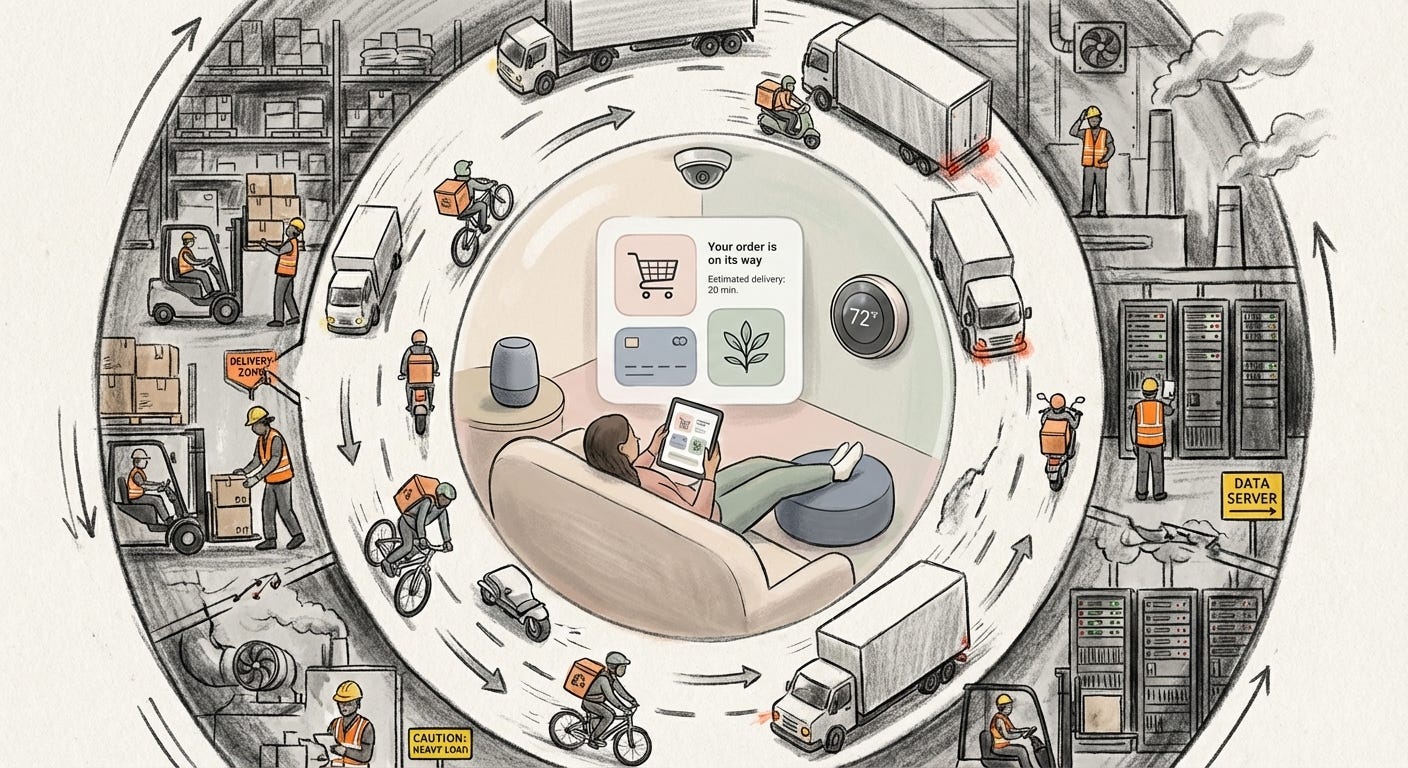
Design plays the role of liaison. A calm, well-crafted UI gently nudges us toward the most convenient options and keeps unpleasant details out of frame. There is no prompt asking whether we are comfortable with labor practices or data extraction. There are only gracious microinteractions, reassuring icons, maybe a leaf graphic hinting at sustainability.
We tell ourselves stories about values and ethics. Then we behave like the interface invites us to. If something feels 10 percent cheaper and 5 percent faster, the smooth interaction swallows our doubts.
Convenience quiets conscience. That quiet is not accidental.
Dark patterns in pastels
We have learned to spot the old dark patterns: fake timers, guilt-tripping buttons, tricky checkboxes. In response, many products now present as calm and “ethical.” Fewer pop-ups, more clarity, nicer tone.
Yet some of the sharpest manipulations now arrive dressed as user care.
Instagram’s “You’re all caught up” label looked like a small revolution. It created a natural break point, a chance to close the app without FOMO. For a short while, it functioned exactly that way. Then the platform flooded the space beneath that message with infinite recommended posts and ads. The pause point became a funnel into more scrolling.
The pattern recurs. Products launch with clean, “for you” experiences. Once habits are formed, incremental changes pour in: more ads, more tracking, more recommendations, less control. The tone stays polite. The colors stay friendly. The business model quietly tightens around you.
Platforms do not flip from caring to exploitative overnight. They slide. At each step, the design stays just calm enough that you do not feel the line being crossed.
Calm interfaces create the trust that later lets exploitation feel like an update rather than a betrayal.
Inside the glass, this is framed as optimization and growth. Outside the glass, it feels like a slow enshittification of spaces we once loved. By the time we notice, we have already rearranged our habits and social lives around systems that no longer serve us, but are very hard to leave.
Waking up from the calm
The answer is not to demand uglier technology.
Good design can reduce fear, make tools accessible, and genuinely support people under stress. The problem begins when calm becomes an excuse not to look deeper. When the interface is so soothing that it replaces our own judgment.
Anaesthetik grew out of a simple discomfort: the sense that the world is producing more signals, more meaning, and more “careful” design than any of us can actually feel. We are surrounded by images and interfaces that glide across our senses without landing. The risk is not outrage. It is numbness.
Waking up from the calm does not mean throwing away your phone. It means quietly reintroducing friction into how you relate to it.
Let a “friendly” feature irritate you for a moment. Ask why autoplay is on by default. Turn off infinite scroll where you can. Notice how a banking app frames debt. Watch what happens to a platform once it goes public or hits a growth wall. Track your own mood after a session inside a beautifully designed product: do you feel more present, or vaguely drained?
These are small, personal acts of resistance, but they reassert a basic fact: your attention is not neutral fuel. Your calm has a market value.
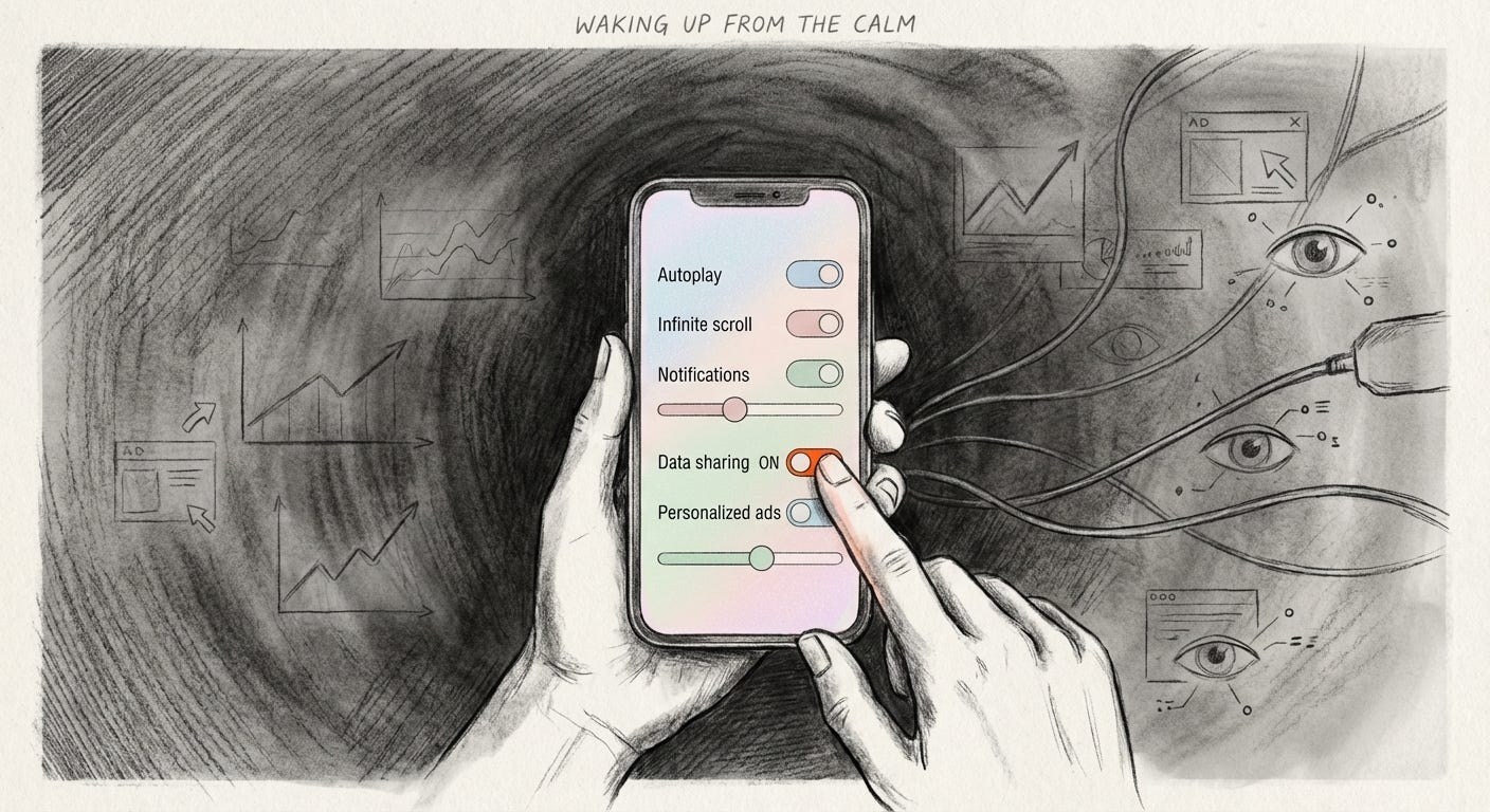
True care in design does not just comfort you. It makes its trade-offs visible. It gives you tools to say no. It treats you not only as a user to retain, but as a person whose consent has to be earned and re-earned.
The next time an interface makes you feel completely held, treat that sensation as a prompt. What decisions are being made for you in that moment? Who benefits from your comfort, and who might be paying for it out of sight?
Calm can be kindness. It can also be camouflage.
Visual archive → afterimage
You’re reading Anaesthetik. The connection got louder. We feel less.