

Ambient Credibility
Suits all the way

Muted beige, gentle serif type, a green tendril in the frame. Before a word is read, a mood of trust settles in. A page that looks composed feels like someone thought it through. The room, or the screen, starts vouching for the person inside it.
We like to think we trust arguments. Often, we trust atmospheres.
Credibility now arrives as a feeling before it arrives as a fact.
Mood that stands in for proof
Our minds move faster than our scrutiny. In the first second on a page or profile, there is no real time to check sources, scan history, or compare claims. So we reach for whatever is easiest: how it looks.
Studies on web use keep returning to the same point. When people land on a site, their first impressions are overwhelmingly design driven. A clear layout, balanced typography, and a coherent color palette quietly register as “serious”. Many users even admit that they judge a company’s credibility mostly from the look of its website. Visual order stands in for institutional order.
This is ambient credibility. Instead of explicit proof, we get a low, constant signal that something is respectable. Serif fonts hint at tradition. Soft palettes promise calm. White space and alignment suggest control. Together, they produce a feeling of intentionality that we read as trustworthiness.
It is not that the proof disappears. It simply arrives later, and sometimes never. The mood has already done enough.
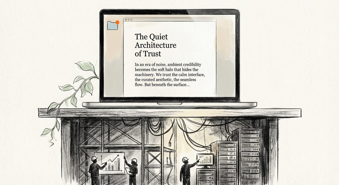
Serif, beige, and the taste of authority
Across personal sites, Substack newsletters, and “serious” blogs, a common style has settled in. Warm neutrals. Eggshell backgrounds. Refined serifs. A little texture, never too much. The page looks like it could be bound in thick paper.
Serif typefaces carry history. They recall books, legal documents, and academic journals, places where words are supposed to have been checked before they were printed. When a newsletter uses a stately serif on a muted background, it borrows that weight. The design reads as measured and thoughtful, even if the content is rushed or tentative.
This is not accidental. Designers know how fonts and colors tilt perception. They know that a certain off-white feels like a quiet study, while a certain black feels like a sales funnel. They know that generous margins signal confidence: we have so little to prove that we can take up space.
A few touches of “artful mess” sharpen the effect. A scanned scribble in the margin, a slightly crooked photograph of a desk, a coffee cup near the keyboard. These small imperfections help the page feel lived in rather than corporate. They imply a single author, a real working surface, a human behind the serif.
So taste becomes a kind of credential. If the layout is careful, we assume the thinking is too.
Backgrounds that speak for us
On video calls, we now curate our credibility in the background.
The blank wall is out. In its place: rows of books, a plant in frame, a framed print, a soft lamp. Studies that tested different video backdrops found that the same face looked more competent and more trustworthy when placed in front of bookcases or greenery than in front of an empty wall. The person has not changed. The room has.
Commentators noticed how quickly this became a ritual. During the pandemic, experts and politicians appeared in front of tall shelves and muted art. The “credibility bookcase” turned into a standard prop, a convenient shorthand for education and depth. Leather spines and hardcovers could do the talking.
LinkedIn portraits and website bios follow the same formula. Softly lit, minimal clutter, maybe a blurred office behind. A plant, a shelf, a neutral wall. The effect is safe and polished, “professional but human”. Not an office, not a bedroom, but a carefully built hybrid of both.
The right backdrop works like a halo that can be rented by the hour.
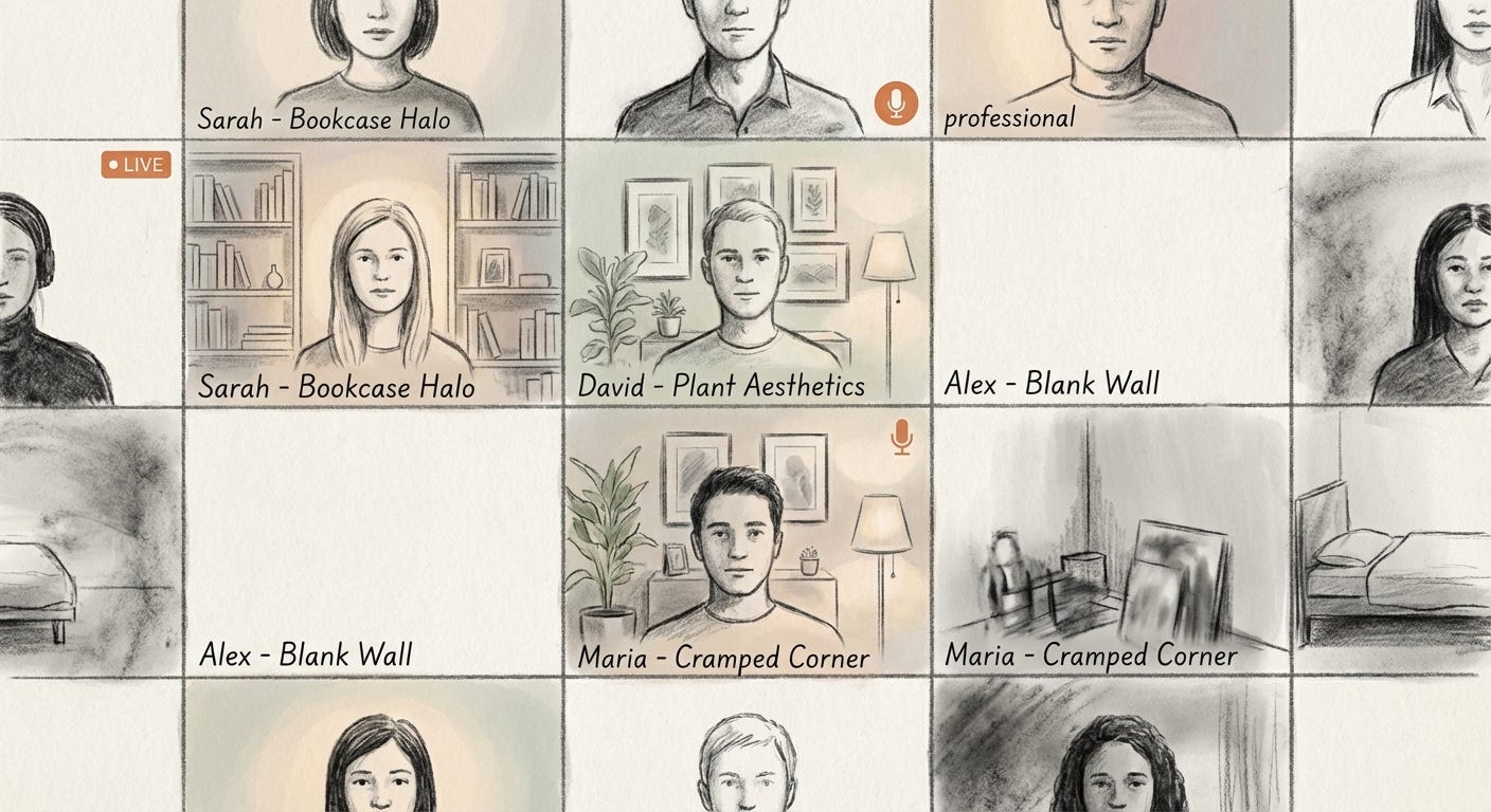
This halo is not cheap. It draws on the same class divide that runs through physical space. Some people have home offices with built-in shelves and natural light. Others take calls from kitchens, shared rooms, or beds. For them, the “neutral, well-staged background” is not a given, it is a constraint.
Platforms do not show that difference. They flatten both into the same rectangle and quietly reward whoever can stage the most reassuring frame.
Who gets to look trustworthy
Ambient credibility is not evenly distributed. It is easier to look credible when you own the room, the camera, and the schedule.
People with stable housing, spare rooms, and time can arrange plants, arrange shelves, adjust lamps. They can invest in better webcams, nicer chairs, quiet corners. Their competence becomes legible at a glance.
People living with roommates, family, or noise have fewer options. They may blur their background or sit against a blank wall, which reads colder and less trustworthy. Their competence has to work harder to surface, because the room is not doing it for them.
On the design side, the same line appears. The writers and makers who can afford to hire designers or spend weeks on their brand are better positioned to project ambient credibility. Their newsletters arrive with immaculate typography and carefully tuned beiges. Their logos say “considered”. Their pages feel like finished objects.
Others might publish equally sharp thinking in rougher wrappers. Their default templates, imperfect screenshots, or busy layouts place them outside the soft aesthetic that now reads as serious. The risk is that readers never discover the difference, because they are already drifting away at the first glance.
Smoothness comforts the already secure. It also keeps the smoothest players at the center of the feed.
The comfort of soft proof
All these cues add up to soft proof. Not evidence in the strict sense, but a credible atmosphere that quiets doubt.
When a site looks tasteful, we hesitate to call it sloppy. When a person appears in soft light with a curated backdrop, we hesitate to think of them as unreliable. The friction of skepticism drops. Questions that might have surfaced remain in the background. The aesthetic has already answered them with a gentle “yes”.
This suits platforms and institutions that benefit from speed. If users can be reassured by visuals, they are less likely to stall, cross-check, or close the window. A frictionless trust response keeps clicks and conversations moving.
None of this is inherently corrupt. Many people who stage their spaces and design their sites with care are genuinely competent, genuinely serious. The problem is not that taste is fake, but that it is so easy to mistake taste for truth.
When ambient credibility becomes formulaic, anyone who learns the formula can borrow the glow. Buy the right lamp, pick the right font, follow the right tutorial, and the atmosphere of trust can be reproduced almost anywhere, around almost anything.
At that point, the halos become interchangeable. Authority turns into a preset.
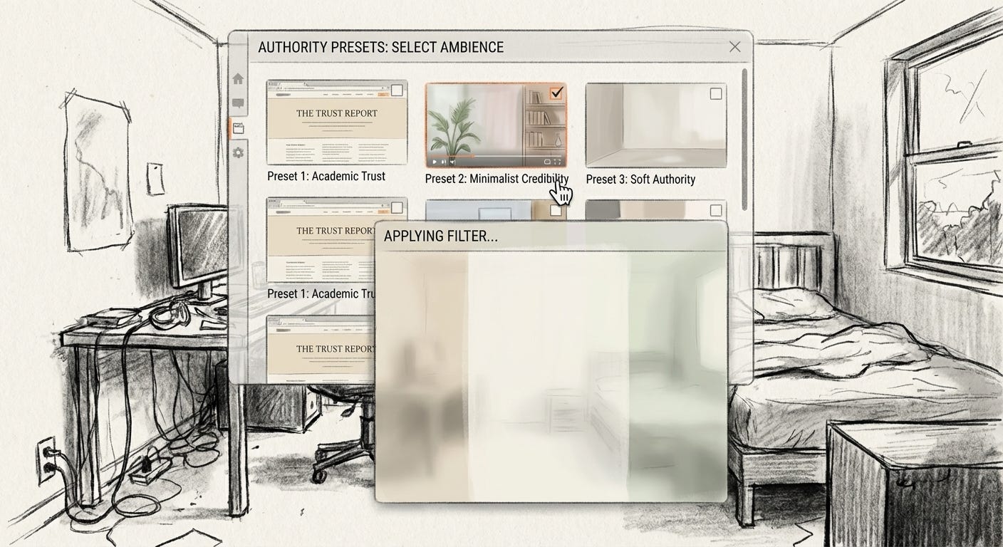
After the glow
Ambient credibility reveals a quiet shift. Trust has not disappeared, but it has moved sideways. It now sits partly in plants, paper tones, margins, and shelves. It flows through layouts and lighting rigs. It is something you can stage.
That staging has a cost. It rewards those who already have space and time to construct the right mood, and it risks flattening everyone else into the wrong one. It nudges us to confuse smoothness with safety, and style with depth.
In this atmosphere, skepticism feels awkward, almost impolite, because the room looks so gentle.
The danger is not that the beige serif is lying to us. The danger is that we stop noticing it is speaking at all.
In a culture of arranged trust, the first thing to question is the room.
Visual archive → afterimage
You’re reading Anaesthetik. The connection got louder. We feel less.